CSS Selectors (Full List)
In this article, I will try to explain clearly what CSS selectors are and how to use each of them. All selectors are described here that you need to know when working with CSS.
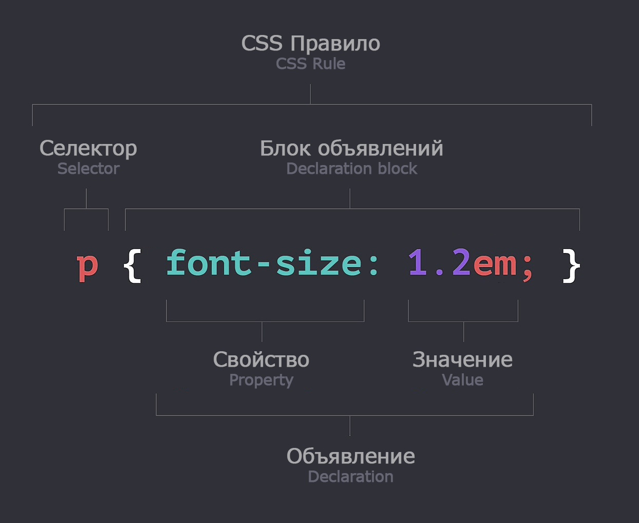
CSS selector — is what allows you to select the required element in an HTML document, and then apply CSS styles (properties) to this element.
See also:
Selectors list
| Selector | Example | Description |
|---|---|---|
* |
* |
All elements. |
#id |
#firstname |
Element with id="firstname". |
.class |
.intro |
All elements with class="intro". |
.class1.class2 |
.name1.name2 |
All elements with class="name1 name2". |
.class1 .class2 |
.name1 .name2 |
All elements with class="name2" whose parent has class="name1". |
tag |
p |
All <p> elements. |
tag.class |
p.intro |
All <p> elements with class="intro". |
tag, tag |
div, p |
All <div> and all <p> elements. |
tag tag |
div p |
All <p> inside all <div>. |
tag > tag |
div > p |
All <p> whose direct parent is <div>. |
tag + tag |
div + p |
<p> which are immediately after <div>. |
tag ~ tag |
div ~ p |
All <p> that are after <div>. |
[attribute] |
[target] |
All elements with target="something". |
[attribute = value] |
[target=_blank] |
All elements with target="_blank". |
[attribute ^= value] |
a[href^="https"] |
Each <a> element whose href attribute starts with "https". |
[attribute $= value] |
a[href$=".pdf"] |
Each <a> element whose href attribute ends with ".pdf". |
[attribute *= value] |
a[href*="w3schools"] |
Each <a> element whose href attribute contains the substring "w3schools". |
[attribute ~= value] |
[title~=flower] |
All elements whose title attribute contains the word "flower". |
[attribute |= value] |
[lang|=en] |
All elements whose lang attribute starts with "en". |
[attr=value i] |
[type="email" i] |
Will select both: <input TYPE="EMAIL"> and <input type="email">. |
:active |
a:active |
Active link. |
::after |
p::after |
Inserts a pseudo-element at the beginning of each <p> element. |
::before |
p::before |
Inserts a pseudo-element at the end of each <p> element. |
::backdrop |
dialog::backdrop |
Styles the background part of a modal element. |
:checked |
input:checked |
All selected <input type="checkbox"> elements. |
:default |
input:default |
All <input> elements. |
:disabled |
input:disabled |
All <input disabled> elements. |
:empty |
p:empty |
All empty <p>, which contain no spaces, text, or other elements. |
:enabled |
input:enabled |
All enabled (not disabled) <input> elements. |
:first-child |
p:first-child |
The first element in the parent element’s list. |
:first-of-type |
p:first-of-type |
The first <p> element in the parent element’s list. |
::first-letter |
p::first-letter |
The first letter of each <p> element. |
::first-line |
p::first-line |
The first line of each <p> element. |
:focus |
input:focus |
<input> that has the cursor in it. |
:focus-visible |
a:focus-visible |
Focus will trigger only if the user moved to the button from the keyboard via TAB. |
:focus-within |
div:focus-within |
Triggers on the block when one of its inner elements is in focus. |
:hover |
a:hover |
A link that the mouse is hovering over. |
:in-range |
input:in-range |
All <input> elements with a value within the specified min/max range. |
:out-of-range |
input:out-of-range |
All <input> elements with a value outside the specified min/max range. |
:indeterminate |
input:indeterminate |
All <input> elements in the indeterminate status. |
:invalid |
input:invalid |
All <input> with an invalid value. |
:lang(language) |
p:lang(it) |
All <p> elements with lang="it". |
:last-child |
p:last-child |
The last element in the parent element’s list. |
:last-of-type |
p:last-of-type |
The last <p> in the parent element’s list. |
:link |
a:link |
All unvisited links. |
:not(selector) |
:not(p) |
All elements except <p>. |
:not(:only-child) |
div:not(:only-child) |
All <div> elements that contain more than one element. |
:nth-child(n) |
p:nth-child(2) |
The second element in the parent element’s list. |
:nth-of-type(n) |
p:nth-of-type(2) |
The second <p> in the parent element’s list. |
:nth-last-child(n) |
p:nth-last-child(2) |
The second element in the parent element’s list (counting from the end). |
:nth-last-of-type(n) |
p:nth-last-of-type(2) |
The second <p> in the parent element’s list (counting from the end). |
:only-child |
p:only-child |
The only <p> element in the parent (no other elements are possible). |
:only-of-type |
p:only-of-type |
One <p> in the parent (other elements may exist). |
:optional |
input:optional |
All <input> elements that do not have the "required" attribute. |
:required |
input:required |
All <input> elements that have the "required" attribute. |
:out-of-range |
input:out-of-range |
All <input> elements with a value outside the specified range. |
::placeholder |
input::placeholder |
All <input> elements that have the "placeholder" attribute. |
:read-only |
input:read-only |
All <input> elements that have the "readonly" attribute. |
:read-write |
input:read-write |
All <input> elements that do not have the "readonly" attribute. |
:root |
:root |
The root of the document. |
::selection |
::selection |
Selects the current text selection made by the mouse. |
:target |
#news:target |
Selects the element with id="news" when you click on it. |
:valid |
input:valid |
All <input> elements with a valid value. |
:visited |
a:visited |
All visited links. |
:where() |
:where(.foo, .bar) a |
Same as .foo a, .bar a, but the WEIGHT of the selectors inside parentheses is not counted. |
:is() |
:is(.foo, .bar) a |
Same as .foo a, .bar a. Convenient for writing many selectors compactly. |
:has() |
div:has(.foo, .bar) |
DIV that contains an element with class foo or bar. |
:scope |
:scope > .foo |
Direct descendants of .foo for the current context. |
ns|E |
svg|a |
a in the SVG namespace. |
A || B |
col.price || td |
All td from the column col.price. |
Description of CSS selectors
*
Selects absolutely all elements. For example, this code resets the internal and external margins for all elements on the page:
* { margin:0; padding:0; }
* can be used together with other selectors. For example, let’s highlight all child elements of #container with a solid black border 1px wide.
#container * { border: 1px solid black; }
* creates increased load on the browser’s performance, so use it only when necessary.
.class
Selects an element that has an class attribute with the specified value: class="myclass".
The class name may consist of Latin letters (a-zA-Z), digits (0-9), the hyphen symbol, and underscore (- _).
The following code sets the red text color for all elements with the error class -
<div class="error">
.error { color: red; }
A single element can have multiple classes (separated by spaces): <div class="error myclass">.
#id
Selects an element that has an id attribute with the specified value: id="myid".
An identifier can be assigned to only one element on the page (if you assign it to multiple elements, the world won’t collapse, but this is not done).
The identifier must consist of Latin letters (a-zA-Z), digits (0-9), the hyphen or underscore symbol: - _. It must start only with a letter!
The following code sets the width and margin of the element with the given identifier:
<div id="container">
#container { width: 960px; margin: auto; }
The ID selector has higher priority than the class selector (see the beginning of the article). Therefore, when possible, use class selectors; this is considered good practice and will allow you to “override” styles with less effort if needed.
tag
The HTML tag selector. Applies to all specified elements in the document. Often used to set color, background, font, and more.
The following code sets the text color for all links and margins for UL lists:
a { color: red; }
ul { margin-left: 0; }
X, Y
Combines several selectors so that all selected selectors get the same styles.
The following code sets the text color for headings h2 and links inside the LI tag:
h2,
li a { color: red; }
X Y
Selects elements Y that are children of X. It can consist of multiple selectors: X Y Z. First, the parent must be specified, and then the child elements. Their number can be anything. Style properties will be applied only to the last element.
For example, the following code selects any <а> element that is a descendant of the <li> element: (<li><a href="ссылка">текст</a></li>):
li a { text-decoration: none; }
This rule can be combined with IDs and classes: body.opera a{ color:blue; }.
X > Y
Selects elements Y that are children of X. Only the first level of child elements is selected.
Example:
.parent > li{ border: 1px solid red; }
This will add a margin for the first-level li, i.e. those that are direct descendants of the ul element:
<ul class="parent">
	<li> список1
		<ul class="child">
			<li>список11</li>
			<li>список12</li>
		</ul>
	</li><!-- affected -->
	<li>список2</li><!-- affected -->
	<li>список3</li><!-- affected -->
</ul>
This rule will not affect <ul class="child">.
X ~ Y
Selects all elements Y that are located after X (at the same level). Behavior is similar to X + Y. The difference is that all following elements will be selected, not only the first one.
For example, in the specified code, all p elements that are located after div will be selected:
div ~ p { color: red; }
It will color "text 2" and "text 3":
<div>text</div>
<p>text 2</p><!-- color: red; -->
<p>text 3</p><!-- color: red; -->
X + Y
Selects the first element Y that is located after X (not nested, but next to it). Styles will be applied only to the first Y element.
For example, the following code sets the text color in the p element that is immediately after div:
div + p { color: red; }
We get:
<div>text</div>
<p>text 2</p><!-- color: red; -->
<p>text 3</p>
a:link, a:visited, a:hover, a:active, a:focus
Selects elements (usually form fields or links) depending on their state.
a:link— selects a normal (unvisited) link. Usually this selector is written simply asa.a:visited— selects an already visited link.a:hover— selects the link that the mouse is hovering over (under the cursor).a:active— selects the active link (the one that was clicked, while it hasn’t been clicked elsewhere yet or when it switches to the link during keyboard TAB navigation).a:focus— selects the active link (the one that was clicked, but the mouse button hasn’t been released yet).
a:link   { color: red; }    /* you can write just a{  } */ /* all unvisited links */
a:visted { color: purple; } /* all visited links */
a:hover  { color: green; }  /* link under the cursor */
a:active { color: blue; }   /* pressed link */
a:focus  { color: dark; }   /* link at the moment of pressing */
[attr]
Selects elements that contain the specified attribute. Attribute selector.
a[title] { color: green; }
This will color only "text":
<a href="" title="description">text</a>
<a href="">text 2</a>
[attr = value]
Selects elements, which have an attribute with the specified value. Attribute selector with an exact value.
a[href="http://example.com"] { color: red; }
This will color only "text":
<a href="http://example.com">text</a><!-- color: red; -->
<a href="http://example.com/article">text 2</a>
[attr *= value]
Selects elements, where the value of the specified attribute contains the specified substring. Attribute selector with a partial match.
a[href*="example"] { color: red; }
It will color "text" and "text 2":
<a href="http://example.com">text</a><!-- color: red; -->
<a href="http://example.com/article">text 2</a><!-- color: red; -->
<a href="http://xxx.ru/article">text 2</a>
[attr ^= value]
Selects elements whose attribute value starts with the specified string. Attribute selector with a value at the beginning.
a[href^="http"] {
   background: url(path/to/external/icon.png) no-repeat;
   padding-left: 10px;
}
This will set the background image only for "text":
<a href="http://example.com">text</a>
<a href="https://wp-kama.ru/article">text 2</a>
[attr $= value]
Selects elements whose attribute value ends with the specified string. Attribute selector with a value at the end.
For example, select elements that link to files of a certain extension.
a[href$=".jpg"] { color: red; }
It will select a links that refer to images in .jpg format. This will color only "text":
<a href="http://example.com/foto.jpg">text</a>
<a href="http://example.com/foto2.png">text 2</a>
[attr ~= value]
Selects elements whose attribute value contains the specified word. Attribute selector with one of the values separated by spaces.
It is somewhat similar to *=, with the difference being:
*=— findshomeanywhere in the value. It will findhomeland.~=— findshomeseparated by a space. It will findhome land.
a[data-info ~= "external"] { color: red; }

a[data-info ~= "image"] { border: 1px solid black; }
It will work like this:
<a href="http://example.com" data-info="external">text</a><!-- colors it red -->

<a href="http://nettuts.com">text 2</a><!-- won’t touch -->

<a href="http://example.com" data-info="external image">text 3</a><!-- colors and sets a border -->

<a href="http://example.com" data-info="image">text 4</a><!-- sets the border -->
Not many people know about this selector, and yet it can be very convenient sometimes.
[attr |= value]
Selects elements whose attribute value equals the specified string or starts with it.
Example: [lang |= ru] — elements with the lang attribute whose value is equal to ru or starts with ru-, for example "ru-RU". But it is practically not used, and it is replaced by the combination: [lang = ru], [lang ^= ru-].
[attr=value i]
Flags in attribute selectors (Attribute flags).
[attr=value i]- Compare the attribute value without regard to case (ASCII case-insensitive).[attr=value s]- Strict comparison with regard to case (case-sensitive), even if the document/language might treat it differently.
Examples:
<input TYPE="EMAIL">
<input type="email">
[type="email"] { outline: 2px solid red; }     /* matches only the second */
[type="email" i] { outline: 2px solid green; } /* matches both */
Example with s:
<div data-id="AbC"></div>
<div data-id="abc"></div>
[data-id="AbC" s] { border: 1px solid; } /* matches only AbC */
:root
A pseudo-class that "selects" the root element of the document.
For HTML, it "selects" the <html> element and is identical to the html tag selector. For the DOM tree in JS, it "selects" the document element.
Specificity :root is higher than the html selector. Because for :root class specificity is applied (10), while for html it’s tag specificity (1).
Often used to declare CSS Variables:
:root {
  --main-color: hotpink;
  --pane-padding: 5px 42px;
}
:target
Highlights the active anchor in HTML. Suppose we have a link that points to an internal anchor <a href="#anchor"> on the page; then when clicking that link, this selector will highlight the element that has the attribute id="anchor".
:target { color: red; }
We get:
<a href="#anchor1">Go to anchor 1</a>
<a href="#anchor2">Go to anchor 2</a>

<!-- When clicking these links, the corresponding element below will be selected -->

<p id="anchor1">Element 1</p>
<p id="anchor2">Element 2</p>
:checked
Styles the selected radio / checkbox. It can be used with the input or option tag, or without them: input:checked, option:checked or :checked.
For example, the following code highlights with a solid black 1px border the area near the enabled checkbox:
input[type=radio]:checked { border:1px solid black; }
:default
Selects the form element that is considered the default element. Works with <button>, <input>, <option> tags.
<form>
	<input type="submit"><!-- will be selected -->
	<input type="submit">
	<input type="reset">
</form>
-
<option>is considered default (:default) if it is an element with theselectedattribute or the firstenabled(NOT disabled) element in the order of DOM elements. For<select multiple>, eachselectedelement will be considered default. -
<input type="checkbox">and<input type="radio">are considered default if they are checked (have thecheckedattribute). <button>is considered default if it is the form's base submit button (<form>) — this is the first button in the form by the order of DOM elements. This is also true for<input type="submit">types.
:disabled
Selects any disabled (inactive) element.
An element is considered disabled when it can’t be interacted with (select, click, focus, enter anything, etc.). If the element is not disabled, then by default its status is enabled.
Examples
Set the background color for all disabled form fields of type text: <input type="text">:
<form action="#">
	<legend>Shipping address</legend>
	<input type="text" placeholder="Name">
	<input type="text" placeholder="Address">
	<input type="text" placeholder="Zip Code">
</form>
input[type="text"]:disabled {
	background: #dddddd;
}
Set the background color for elements <select class="country" disabled> — all disabled SELECT elements with the COUNTRY class:
select.country:disabled {
	background: #dddddd;
}
:enabled
Selects the enabled (active) element.
An element is considered enabled when it can be interacted with (select, click, focus, enter anything, etc.). enabled elements are all elements that are not disabled.
Examples
Set a white background color for all active (enabled) <input> elements and gray for all inactive (disabled) ones:
<form action="#">
	<legend>Shipping address</legend>
	<input type="text" placeholder="Name" disabled="disabled">
	<input type="text" placeholder="Address">
	<input type="text" placeholder="Zip Code">
</form>
input[type="text"]:enabled {
	background: #fff;
}

input[type="text"]:disabled {
	background: #dddddd;
}
:empty
Selects any empty element. Empty means it must contain nothing (no nodes): neither spaces, nor text, nor other elements. An HTML comment inside a tag does not fill the element (it is still considered empty).
If an element contains anything at all, a space, a line break, then it will be considered not empty (this selector won’t work). Therefore, instead of this selector, it might be better to use :has().
.box {
	background: red;
	height: 200px;
	width: 200px;
}

.box:empty {
	background: lime;
}
<div class="box"><!-- empty --></div>
<div class="box">I will be red</div>
<div class="box">
	<!-- I will be red because there are spaces before the comment -->
</div>
::before
Pseudo-element. X::before adds a pseudo-element at the beginning of X (inside the tag).
It works only together with the content:'' property, which specifies the content of the added element. content must be specified even if it is empty (content:'') — the element must always contain something.
For example, using these styles, you can specify an icon for an LI list item:
li::before {
	content: '-';
	display: inline-block;
	margin-right: .5em;
}
You can use a single colon :before. It is more correct to write two — ::before. This notation emphasizes that it is a pseudo-element, not a selector.
::after
Pseudo-element. X:after adds a pseudo-element at the end of X (inside the tag).
It works only together with the content:'' property, which specifies the content of the added element. content must be specified even if it is empty (content:'') — the element must always contain something.
For example, with such styles, you can create a block that will clear all preceding floated elements. In the past, this was a common layout technique:
.clear::after {
	content: '';
	display: table;
	clear: both;
}
You can use a single colon :after. It is more correct to write two — ::after. This notation emphasizes that it is a pseudo-element, not a selector.
::backdrop
The pseudo-class ::backdrop styles the background part of the modal element when it is open.
This is a kind of backdrop behind a modal window; often it’s a semi-transparent black background. The backdrop will be visible only when the modal window is open.
<dialog open>HTML of the Modal Window</dialog>
dialog::backdrop {
	background-color: rgba(0, 0, 0, 0.5);
}
::backdrop works only with interactive elements:
<dialog>(when opened)<iframe>(in fullscreen mode)<video>(in fullscreen mode)<html>or<body>(in document fullscreen mode)
For regular elements like <div>, ::backdrop does not apply.
Alternative
::backdrop has a bug in Firefox and can be replaced like this:
.modal {
	box-shadow: 0 0 0 100vw rgb(0 0 0 / 0.5); /* huge shadow */
}
:focus
Selects the focused active HTML element.
It is usually applied to form elements. It can be applied to any element that can receive focus via the keyboard, or that is intended for user input.
Example. When moving the cursor into the <input type="text"> field, its background will be changed to yellow:
input:focus {
  background-color: yellow;
}
Example. Styles will apply to any link <a> that was clicked:
a:focus {
  outline: 2px solid yellow;
}
Example. When moving the cursor into the <input type="text"> field, its width will gradually increase from 100 to 250 pixels:
input[type=text] {
  width: 100px;
  transition: ease-in-out, width .35s ease-in-out;
}

input[type=text]:focus {
  width: 250px;
}
:focus-visible
Applied when an element matches the pseudo-class :focus and the browser considers that the focus should be "highlighted".
For example, focus when clicking with the mouse should not be shown in any way, but when navigating using TAB from the keyboard it should be shown—in this case this pseudo-selector will trigger.
:focus-within
A pseudo-class that applies to an element if it itself or any of its child elements is in focus.
In other words, it represents the element that itself matches the pseudo-class :focus or has a descendant that matches :focus.
It includes descendants in Shadow DOM shadow trees.
This selector is useful, for example, for highlighting the whole <form> container when the user focuses on one of its <input> fields.
Examples:
This example selects the <div> when one of its descendants is focused:
div:focus-within {
  background: cyan;
}
Another example with a form:
<form>
  <label for="given_name">Given Name:</label>
  <input id="given_name" type="text">
  <br>
  <label for="family_name">Family Name:</label>
  <input id="family_name" type="text">
</form>
form {
  border: 1px solid;
  color: gray;
  padding: 4px;
}

form:focus-within {
  background: #ff8;
  color: black;
}

input {
  margin: 4px;
}
Browser support {percent}
:hover
Triggers when the mouse pointer is over an element, i.e. when the cursor is above the element. Can be applied to any elements (div, span) — not only to links <a>.
Example. When hovering with the mouse over the link, a black 1px line appears (a replacement for the underline property):
a:hover { border-bottom: 1px solid black; }
In the following code, the background color changes when hovering over the <div> element:
div:hover { background: #e3e3e3; }
:in-range
Selects all <input> elements whose value is within a specified range. The range is set by the min, max attributes or min and max.
For <input> elements, the min and/or max attributes must be specified!
See also :out-of-range.
<input name="amount" type="number" min="2" max="6" value="4">
<input name="amount" type="number" min="2" value="4">
<input name="amount" type="number" max="6" value="4">

<input name="dep" type="date" min="2022-01-01" max="2025-12-31" value="2023-05-05">
input:in-range {
	background-color: green;
}
:out-of-range
Selects all <input min="1" max="50"> elements whose value is outside the specified range.
For <input> elements, the min and/or max attributes must be specified!
See also :in-range.
<input name="amount" type="number" min="2" max="6" value="10">
<input name="amount" type="number" max="20" value="4">

<input name="dep" type="date" min="2022-01-01" max="2025-12-31" value="2027-05-05">
input:out-of-range {
	background-color: tomato;
}
:not(selector)
Selects elements that do not contain the specified selector. Instead of "selector" you can use any selector except pseudo-elements (:first-letter). Double negation is not allowed: :not(:not(...)).
The following code selects for styling all elements except the p element:
*:not(p) { color: green; }
In this example, all li elements are selected that do not have the .last class:
ul li:not(.last) { color: blue; }
It will select "element 1" and "element 2":
<ul>
	<li>element 1</li>
	<li>element 2</li>
	<li class="last">element 3</li>
</ul>
::first-line, ::first-letter
::first-linestyles the initial (first) line.::first-letterstyles the initial (first) letter. Only properties tied to many parameters change: browser window width, language, font, etc.
These selectors are commonly written with a double colon ::first-line, but you can also write with one :first-line.
#1 We select the first letter in a paragraph
Applies the specified styles to all initial letters of all paragraphs in the document.
p::first-letter {
	float: left;
	font-size: 2em;
	font-weight: bold;
	font-family: cursive;
	padding-right: 2px;
}
#2 We select the first line in a paragraph
Applies the specified styles to all initial lines of all paragraphs in the document.
p::first-line {
	font-weight: bold;
	font-size: 1.2em;
}
:nth-child(n)
X:nth-child(n) selects every "n-th" element X that is at the same level as X. Counts all elements on the level of X (no matter what type the X element is). “Type” means the element’s tag (div, span, li), not its class.
-
Interactive testing :nth selectors.
- Interactive generator :nth selectors
Possible values for n:
odd— odd numbers.even— even numbers.integer— the ordinal number starting from 1.expression with nAn+B—AandBare integers,nis a counter from 0 to 999...
Use :nth-last-child() to make similar selections but counting from the end.
There is also a similar selector :nth-of-type(n). The difference is that X:nth-child(n) counts all elements on the same level regardless of type, while X:nth-of-type(n) counts only the elements of the same type as X on the same level. For example:
<h1>Heading</h1>
<p>First paragraph.</p><!-- p:nth-child(2) -->
<p>Second paragraph.</p><!-- p:nth-of-type(2) -->
Example with n = odd and n = even
Color even and odd paragraphs in different colors:
p:nth-child( odd ) {
	background: red;
}
p:nth-child( even ) {
	background: blue;
}
We get:
<h1>Heading</h1>
<p>First paragraph.</p><!-- blue -->
<p>Second paragraph.</p><!-- red -->
<p>Third paragraph.</p><!-- blue -->
Example with n = integer
Sets the color of the second element to red:
p:nth-child(2) { color: red; }
This will color "Second paragraph.":
<h1>Heading</h1>
<p>First paragraph.</p><!-- red -->
<p>Second paragraph.</p>
<p>Third paragraph.</p>
Example with n = expression
Using the micro-syntax An+B — :nth-child(An+B) you can make different selections:
Where:
Ais a number that will be multiplied byn.nis a counter from 0–999 -{ An+B; n = 0, 1, 2, ... }.Bis a number (offset).
Examples:
:nth-child(2): the second element (only "A" is specified).:nth-child(2n): all even elements (2, 4, 6, 8, etc.).:nth-child(2n+1): all odd elements (1, 3, 5, 7, etc.).:nth-child(5n+1): 1 (=(5×0)+1), 6 (=(5×1)+1), 11 (=(5×2)+1), etc.:nth-child(5n+2): 2 (=(5×0)+2), 7 (=(5×1)+2), 12 (=(5×2)+2), etc.:nth-child(3n+4)- 4, 7, 10, 13 ...
You can omit parameter A in An+B:
:nth-child(n+3): all elements starting from the third (3, 4, 5...).:nth-child(-n+5): all elements up to the fifth (1, 2, 3, 4, 5).
By combining multiple :nth-child() you can select ranges of elements:
:nth-child(n+3):nth-child(-n+5): all elements from the third to the fifth (3, 4, 5).
Alternatives:
:nth-child(odd)can be replaced with:nth-child(2n+1)— 1, 3, 5, 7 ...:nth-child(even)can be replaced with:nth-child(2n)— 2, 4, 6, 8 ...:first-childcan be replaced with:nth-child(0n+1)or:nth-child(1).
Example: refer to every third element at the current level of element P:
p:nth-child(3n) { background: red; }
We get:
<h1>Heading</h1>
<p>Paragraph 1</p>
<p>Paragraph 2</p>
<p>Paragraph 3</p><!-- background: red -->
<p>Paragraph 4</p>
<p>Paragraph 5</p>
<p>Paragraph 6</p><!-- background: red -->
<p>Paragraph 7</p>
<p>Paragraph 8</p><!-- background: red -->
<p>Paragraph 9</p>
:nth-last-child(n)
Works exactly the same as :nth-child(n), but the counting starts not from the top (from the beginning), but from the bottom (from the end).
n can be:
odd— odd numbers.even— even numbers.integer— the ordinal number starting from 1.expression with nan+b—aandbare integers,nis a counter from 0 to 999...- see example >
The following code will set the color of the second from the end paragraph to red:
li:nth-last-child(2) { color: red; }
It will color "Second paragraph.":
<h1>Heading</h1>
<p>First paragraph.</p>
<p>Second paragraph.</p><!-- red -->
<p>Third paragraph.</p>
See more examples in the previous selector :nth-child(n).
:nth-child(An+B of S) and :nth-last-child(An+B of S)
In CSS Selectors Level 4 there is an ability to pass a list of selectors to :nth-child() and :nth-last-child().
When S is specified, the An+B logic is applied only to elements that match the specified selector S. This means that elements are first filtered by the specified selector and only then the An+B logic is applied.
For example, the selector :nth-child(2 of .foo) will select the second element with the .foo class.
div :nth-child(2 of .foo) { color: red; }
<div>
	<h1>Heading</h1>
	<p class="foo">First paragraph.</p>
	<p>Second paragraph.</p>
	<p class="foo">Third paragraph.</p><!-- red -->
</div>
Note that S is a list of selectors (possibly more than one, separated by commas). For example:
:nth-child(4 of .highlight, .sale)
Example with zebra table
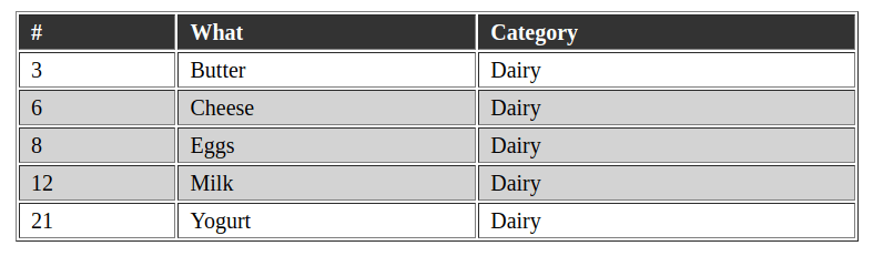
A classic example of using :nth-child() is creating a table with alternating rows of different colors (zebra style). This is a visual technique where each table row alternates colors. Usually it is done like this:
tr:nth-child(even) {
	background-color: lightgrey;
}
Everything works well as long as the tables are static. The problem appears when table rows are dynamically hidden. For example, if you hide rows 4, 5, 7 (see the image), then the visible ones will be those with the same background color:
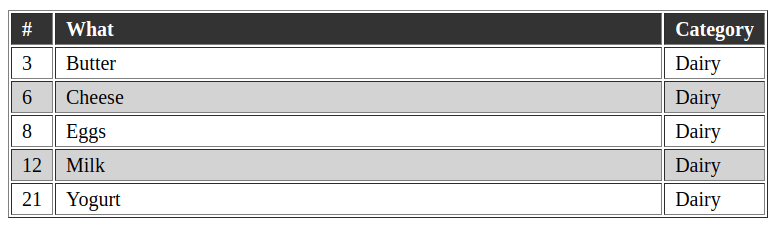
To fix this, you can use :nth-child(An+B of S), excluding the hidden rows from the An+B logic:
tr:nth-child(even of :not([hidden])) {
	background-color: lightgrey;
}
:nth-of-type(n)
Selects an element by the number specified in n. X:nth-of-type starts counting from the first element of type X on the same level. “Type” means the element tag itself (div, span, li), not its class.
Note: there is a similar selector :nth-child(n). The difference is that X:nth-of-type(n) will select only elements of type X that are on the same level, while X:nth-child(n) counts all elements of all types on the same level, regardless of what type is specified in X. For example:
<h1>Heading</h1>
<p>First paragraph.</p><!-- p:nth-child(2) -->
<p>Second paragraph.</p><!-- p:nth-of-type(2) -->
n can be:
odd— odd numbers.even— even numbers.integer— the ordinal number starting from 1.expression with nan+b—aandbare integers,nis a counter from 0 to 999...- see example >
#1 n = add / even
Let’s color even and odd paragraphs in different colors. It counts exactly the paragraphs without h1, as :nth-child does:
p:nth-of-type(odd)  { background: red; }
p:nth-of-type(even) { background: blue; }
We get:
<h1>Heading</h1>
<p>First paragraph.</p><!-- red -->
<p>Second paragraph.</p><!-- blue -->
<p>Third paragraph.</p><!-- red -->
#2 n = integer
Sets the second element to red:
li:nth-of-type(2) { color: red; }
It will color "Second paragraph.":
<h1>Heading</h1>
<p>First paragraph.</p>
<p>Second paragraph.</p><!-- red -->
<p>Third paragraph.</p>
#3 n = expression
Expression formula: an + b, where "a" is the number that will be multiplied by n, "n" is a counter from 0–999, "b" is a number, offset. { an + b; n = 0, 1, 2, ... }
- in the selector
:nth-of-type(2), only "a" is specified. :nth-of-type(odd)can be replaced with:nth-of-type(2n+1)— 2, 4, 6, 8 ...:nth-of-type(even)can be replaced with:nth-of-type(2n)— 1, 3, 5, 7 ...:nth-of-type(3n+4)— 4, 7, 10, 13 ...:first-of-typecan be replaced with:nth-of-type(0n+1)or simply:nth-of-type(1)
For example: refer to every third p element on the current level where the p elements are located:
p:nth-of-type(3n) { background: red; }
We get:
<h1>Heading</h1>
<p>Paragraph 1</p>
<p>Paragraph 2</p>
<p>Paragraph 3</p><!-- background: red -->
<p>Paragraph 4</p>
<p>Paragraph 5</p>
<p>Paragraph 6</p><!-- background: red -->
<p>Paragraph 7</p>
<p>Paragraph 8</p>
<p>Paragraph 9</p><!-- background: red -->
:nth-last-of-type(n)
Selects the element by the number specified in n. X:nth-last-of-type(n) starts counting from the last element of X on the same level.
This is the same selector as :nth-of-type(n), but it counts the opposite way — from the end.
For example: refer to every third p element from the end on the current level where the p elements are located:
p:nth-last-of-type(3n) { background: red; }
We get:
<h1>Heading</h1>
<p>Paragraph 1</p><!-- background: red -->
<p>Paragraph 2</p>
<p>Paragraph 3</p>
<p>Paragraph 4</p><!-- background: red -->
<p>Paragraph 5</p>
<p>Paragraph 6</p>
<p>Paragraph 7</p><!-- background: red -->
<p>Paragraph 8</p>
<p>Paragraph 9</p>
See more examples in the previous selector :nth-of-type(n).
:first-child
X:first-child selects the first element that is on the same level as X. The counting starts from any element, not necessarily X.
X:first-child is the same as X:nth-child(1)
#1 Example: refer to the first element in the block #container
#container div:first-child{ color:red; }
We get:
<div id="container">
	<div>element 1</div><!-- color:red; -->
	<div>element 2</div>
</div>
But this won’t highlight anything:
<div id="container">
	<h1>Heading</h1>
	<div>element 1</div><!-- won’t highlight -->
	<div>element 2</div>
</div>
#2 Reset border
:first-child is sometimes used to reset the border property on the boundary elements of a list. The following code resets the top border value of the li element that is a child of the ul:
ul li:first-child { border-top: none; }
:last-child
X:last-child selects the first from the end element that is on the same level as X. The counting starts from any element, not necessarily X.
X:last-child is the same as X:nth-last-child(1)
#1 Example: refer to the first from the end element in the block #container
#container div:last-child{ color:red; }
We get:
<div id="container">
	<div>element 1</div>
	<div>element 2</div><!-- color:red; -->
</div>
And this will not highlight anything (because we are saying to color the DIV, which is the last element in the block, but here the last element is P):
<div id="container">
	<div>element 1</div>
	<div>element 2</div><!-- won’t highlight -->
	<p>paragraph</p>
</div>
However, if you don’t specify the tag, then the last element will be selected:
#container :last-child{ color:red; }
/* or */
#container *:last-child{ color:red; }
<div id="container">
	<div>element 1</div>
	<div>element 2</div>
	<p>paragraph</p><!-- color:red; -->
</div>
#2 Color the last li element in the ul list green:
ul > li:last-child { color: green; }
We get:
<ul>
	<li>list 1</li>
	<li>list 2</li>
	<li>list 3</li><!-- color: green; -->
</ul>
:first-of-type, :last-of-type
Selects the first / last element with the same tag as X that is on the same level as X. Counts only tags X.
X:first-of-type is the same as X:nth-of-type(1)
#1 Example: refer to the first div element in the block #container
#container div:first-of-type{ color:red; }
We get:
<div id="container">
	<h1>Heading</h1>
	<div>element 1</div><!-- color:red; -->
	<div>element 2</div>
</div>
#2 Reset border
:first-of-type is often used to reset the border property on boundary elements of a list:
ul li:first-of-type { border-top: none; }
We get:
<ul>
	<span>text</span>
	<li>element 1</li><!-- border-top: none; -->
	<li>element 2</li>
	<li>element 3</li>
</ul>
:only-child
X:only-child selects the element X that is the only one on the level of X. When counting elements, the tag name of X is NOT taken into account.
In other words: selects child elements X only when the parent has a number of all its child elements (regardless of type) equal to 1.
Select the element if it is the only one in the block:
p:only-child { background: red; }
We get:
<div>
	<p>paragraph</p><!-- background: red; -->
</div>

<div>
	<span>paragraph</span><!-- won’t select because X=p and not span -->
</div>

<div>
	<p>text</p><!-- won’t select because at this level there are 2 elements -->
	<span>paragraph</span>
</div>
:not(:only-child)
:only-child with negation :not() is a combination of two pseudo-selectors.
This can be useful to select all elements of the block only if that block contains more than one element.
li:not(:only-of-type) {
  font-size: 1.25em;
}
As a result, if we have one element, it will NOT be selected:
<ul>
	<li></li><!-- won’t be selected -->
</ul>
But if there is more than one, then all will be selected:
<ul>
	<li></li><!-- will be selected -->
	<li></li><!-- will be selected -->
</ul>
:only-of-type
X:only-of-type selects the element X that is the only one on the level of X (it has no neighbors). When counting elements, the tag name of X is taken into account.
In other words: selects child elements X only when the parent has a number of all its child elements of type X equal to 1.
For example:
p:only-of-type { background: red; }
We get:
<div>
	<p>paragraph</p><!-- background: red; -->
</div>

<div>
	<span>paragraph</span><!-- won’t be highlighted because X=p and not span -->
</div>

<div>
	<span>paragraph</span>
	<p>text</p><!-- background: red; -->
</div>
#1 Select ul only with one element in the list.
ul > li:only-of-type { font-weight: bold; }
Another option: you can use ul > li:only-child, because usually in ul lists only li tags are present.
:is()
:is() is a pseudo-class to which you can pass a list of selectors (separated by commas). Then only one of the specified selectors will be selected. This is convenient when you need to write multiple selectors that share the same part in a more compact way.
For example:
.block .block__title,
.block .block__subtitle {
	color: tomato;
}

/* can be written like this */
.block :is(.block__title, .block__subtitle) {
	color: tomato;
}
Another example:
input:is(:hover, :focus) {
	color: blue;
}
Weight (specificity) of :is()
:is() preserves the weight (specificity) of the selector specified in the list.
The weight of the strongest selector from the list is also used. For example:
.content :is(h1, h2, #h3) {
	color: tomato; // weight `.content h2` will be like `.content #h3`
}
Difference between :is() and :where()
The difference is that :is() accounts for the specificity of the selector (it takes the specificity (weight) of the most specific selector from the list), whereas :where() does not apply the whole specificity — it has a zero specificity, and the specificity of the selectors specified in the list equals 0.
Watch the video where Kevin explains in detail how the pseudo-classes differ: :is() :where() :has():
:where()
Same as :is(), but all selectors in the list have zero weight (specificity). This is a selector weight killer.
You can use it, for example, when you need to specify base styles that require minimal specificity. For example:
:where(.content) :is( h1, h2, h3 ) {
	margin: 1em 0; // weight of this property will be 1 (tag selector)
}
Now, if somewhere below you use such a selector to change the color property, it will work (it will override the style):
h1 {
	margin: 2em 0;
}
:has()
Allows you to select an element if it contains a nested element specified in the list for :has().
For example:
/*
Add padding to the element `.content`, only
if it contains an image (img element)
*/
.content:has(img) {
	padding: 3rem;
}
Another example:
/*
Apply styles to h1 only if there is a paragraph element
that directly follows h1
*/
h1:has(+ p) {
  margin-bottom: 0;
}
Another example:
<label>
	<span>Phone</span>
	<input type="text" name="phone">
</label>
input { color: black; }
span:has(+ input:focus) { color: red; }
Now, when we focus on input, the previous element span color will change to red!
Video about :has()
:scope
:scope is a pseudo-class that allows you to select the element that serves as the current context for selectors that follow after :scope.
The element(s) selected by :scope depend on the context where it is used:
-
At the top level,
:scopeis equivalent to:root, which in a normal HTML document corresponds to the element<html>. -
When used in DOM API calls such as
querySelector(),querySelectorAll(),matches()orElement.closest()—:scopecorresponds to the element on which the method was called. - Inside an
@scopeblock,:scopecorresponds to the root of the scope area defined by that@scopeblock. This allows applying styles to the scope root inside the@scopeblock itself.
For example:
<div class="container">
  <div class="box">
	<p>Text</p>
  </div>
</div>
const container = document.querySelector('.container');
const box = container.querySelector(':scope > .box');
console.log(box); // Finds .box, which is a direct descendant of .container
Another example:
<ul class="list">
  <li>Item 1</li>
  <li>Item 2</li>
</ul>
const list = document.querySelector('.list');
const items = list.querySelectorAll(':scope > li');
console.log(items); // Returns only direct li descendants inside .list
:scope is especially useful for clarifying nested selectors and preventing the selection of elements outside the current context.
ns|E
Namespace selectors (namespace selectors). Used in XML documents and where namespaces actually exist (for example, SVG inside XML). In regular HTML they are almost not needed, but for SVG they sometimes appear.
Syntax:
ns|E- Selects element E in the namespace with prefix ns.*|E- Selects element E in any namespace (including “no namespace”).|E- Selects element E without a namespace.
Example with @namespace:
@namespace svg url("http://www.w3.org/2000/svg");

svg|a { stroke: currentColor; }
svg|circle { fill: red; }
Example “any namespace”:
*|a { text-decoration: underline; } /* a in HTML and in SVG */
Example “only without namespace”:
|a { color: blue; } /* only regular HTML <a>, not svg|a */
A || B
Column combinator. Selects elements B that are in the same table column as A. Works through table semantics (<table>, <colgroup>, <col>).
Idea: you mark a column via <col>, and style all cells (td/th) of that column.
<table>
  <colgroup>
	<col class="name">
	<col class="price">
	<col class="stock">
  </colgroup>

  <tr> <th>Product</th>  <th>Price</th> <th>Availability</th> </tr>
  <tr> <td>Apple</td>  <td>10</td>   <td>Yes</td>      </tr>
  <tr> <td>Banana</td> <td>7</td>    <td>No</td>     </tr>
</table>
col.price || td,
col.price || th {
	font-weight: 700;
}
This means: “all td/th that belong to the same column as col.price”.
:nth-child in more detail
To quickly and accurately understand how pseudo-selectors like :first-child work, I created a special page. There you can also find the selector of this type that suits you for your specific task.
Task
We have the following code:
<div>
	<p>paragraph</p>
	<ul>
	   <li>List 1 </li>
	   <li>List 2 </li>
	</ul>

	<ul>
	   <li>List 3 </li>
	   <li>List 4 </li>
	</ul>
</div>
How to refer to "List 2"?
Solution 1
ul:first-of-type > li:nth-child(2) {
	font-weight: bold;
}
The code finds the first list, then finds its direct descendant whose ordinal number in the list equals 2.
Solution 2
Use adjacent selectors.
p + ul li:last-child {
	font-weight: bold;
}
The browser finds the ul directly after p, and then finds its last child element.
Solution 3
This solution is probably the most correct, because even if other tags appear between ul or li, this example will still select the li we need:
ul:first-of-type li:nth-last-of-type(1) {
	font-weight: bold;
}
The browser selects the first ul (specifically ul), and then finds the first element from the end that is li (specifically li).
Count elements in a block using nth-child
A useful article on Habr — quantitative CSS selectors, teaches how to count elements using nth-child. For example, you need to highlight the first element only if the block contains 6 elements of the specified type. Or you need to highlight all elements of the block if the block has only 6 elements.
A few examples without explanations:
The first element only if there are 6 total:
li:nth-last-child(6):first-child {
  color: tomato;
}

// using :has()
.parent:has(> li:nth-last-child(6)):first-child {
  color: tomato;
}
All elements in the block only if there are 6 total:
li:nth-last-child(6):first-child,
li:nth-last-child(6):first-child ~ li {
  color: tomato;
}

// using :has()
.parent:has(> li:nth-last-child(6)) li {
  color: tomato;
}
Using the selector opposite to :nth-child(n+6) — :nth-last-child(n+6) — we can highlight all elements from the sixth from the end up to the very first from the beginning.
All elements except the last 5, only if the block has 6 or more elements:
li:nth-last-child(n+6) {
  color: tomato;
}
All elements only if the block has 6 or more elements:
li:nth-last-child(n+6),
li:nth-last-child(n+6) ~ li {
  color: tomato;
}
All elements only if the block has 6 or fewer elements:
li:nth-last-child(-n+6):first-child,
li:nth-last-child(-n+6):first-child ~ li {
  color: tomato;
}
All elements of the specified tag (p), only if the block has 6 or more elements with this tag (p):
p:nth-last-of-type(n+6),
p:nth-last-of-type(n+6) ~ p {
  color: tomato;
}
Selecting a range of elements
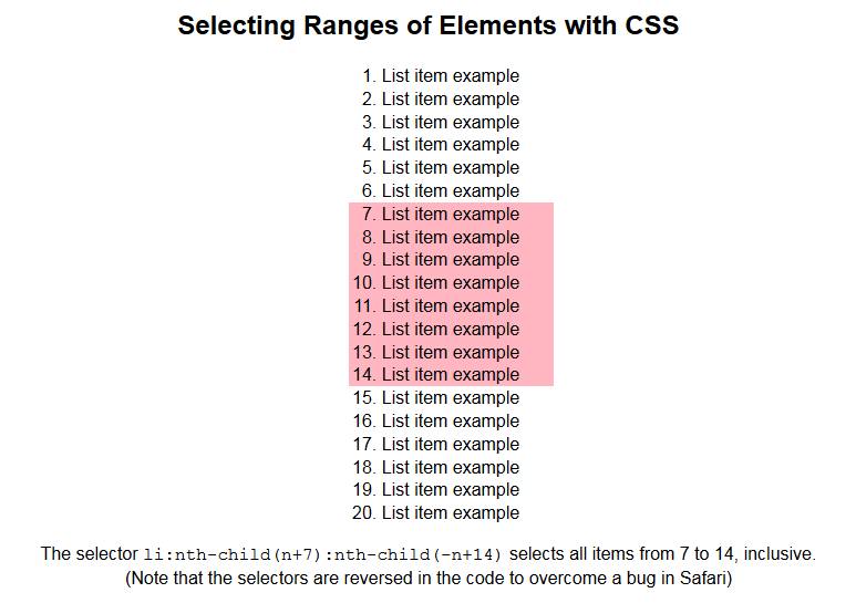
Suppose you have a list of 20 elements and you need to select the elements from 7 to 14 inclusive. This can be done like this:
ol li:nth-child(n+7):nth-child(-n+14) {
  background: lightpink;
}