theme.json parameters
Below we will look at all possible parameters of the theme.json file.
Similar documentation for block.json.
Структure theme.json:
{
	"$schema": 'https://schemas.wp.org/trunk/theme.json',
	"version": 3,
	"title": '',
	"settings": {},
	"styles": {},
	"customTemplates": {},
	"patterns": {},
	"templateParts": {},
}
The structure of theme.json is described in the class WP_Theme_JSON{}.
The current list of possible global parameters is located in the constant WP_Theme_JSON::VALID_TOP_LEVEL_KEYS.
If the theme does not have a theme.json file, the default file wp-includes/theme.json is used.
An example theme.json file from the twentytwentyfive theme:
Access presets elsewhere in the theme.json file
To get preset values from the settings section, for example in styles, you can use a CSS variable:
"color": "var(--wp--preset--color--base)"
Or a special scheme var:preset|{type}|{slug}:
"color": "var:preset|color|base"
"fontSize": "var:preset|font-size|xx-large"
Important: {type} and {slug} must be the same as they will be produced when generating the variable. Here it is important to know that during variable generation camelCase turns into snake-case and numbers are separated by -. For example:
"settings": {
	"typography": {
		"fontSizes": [
			{ "name":"2xs", "slug":"2xs", "size":"20px" }
		]
	}
}
We will get the variable --wp--preset--font-size--2-xs, i.e. you need to specify it like: var:preset|font-size|2-xs
$schema
This parameter specifies a link to the schema for the theme.json file:
https://schemas.wp.org/trunk/theme.json
https://schemas.wp.org/wp/6.8/theme.json
The schema contains information about which parameters and values can be used.
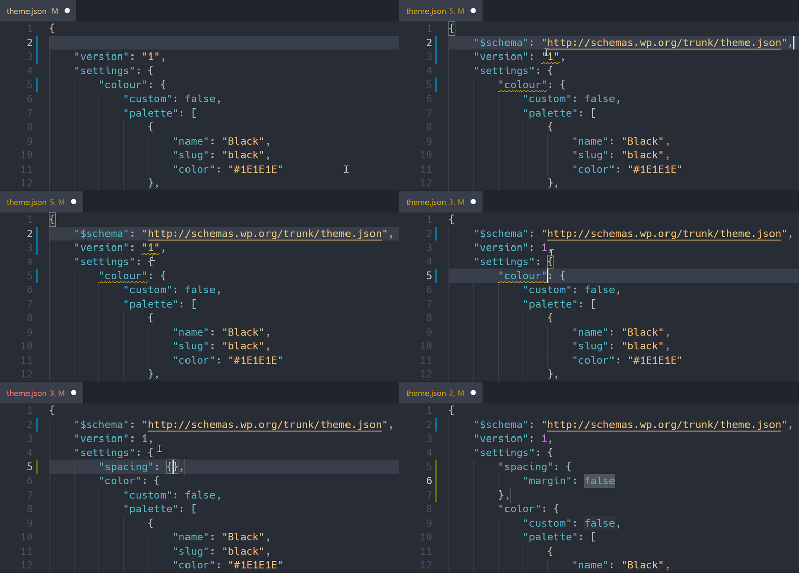
Many code editors (IDEs) can pick up the schema and show autocomplete suggestions.
Add such a line to theme.json:
{
  "$schema": "https://schemas.wp.org/trunk/theme.json"
}
version
This is a required field! The theme.json schema version — parameters and values available in the configuration.
{
	"version": 3,
	...
}
settings
Basic general settings. Blocks that support the specified parameters but do not have custom settings for them will use these base settings.
Here you can configure:
- Which parameters (settings) should be available to the user.
- Default colors, font sizes, etc. available to the user.
- Custom CSS properties and class names used in styles.
- The default editor layout (width and available alignments).
A list of possible parameters (WP 6.8):
For the current list of supported parameters, see the constant WP_Theme_JSON::VALID_SETTINGS.
{
	"appearanceTools"               : true,
	"useRootPaddingAwareAlignments" : true,
	"background"                    : { ... },
	"border"                        : { ... },
	"color"                         : { ... },
	"custom"                        : { ... },
	"dimensions"                    : { ... },
	"layout"                        : { ... },
	"lightbox"                      : { ... },
	"position"                      : { ... },
	"spacing"                       : { ... },
	"shadow"                        : { ... },
	"typography"                    : { ... },
}
viewport (array) (WP 7.1)
Allows you to change the breakpoints for mobile and tablet adaptive block styles.
{
	"version": 3,
	"settings": {
		"viewport": {
			"mobile": "30rem",
			"tablet": "45rem"
		}
	}
}
Parameters
| Parameter | Type | Default | Description |
|---|---|---|---|
mobile |
string |
480px |
Max width for mobile. |
tablet |
string |
782px |
Max width for tablets. |
In the example above, the following ranges will be created:
@media (width <= 30rem) {
	/* @mobile styles. */
}

@media (30rem < width <= 45rem) {
	/* @tablet styles. */
}
The values are used by the adaptive states @mobile and @tablet:
{
	"styles": {
		"blocks": {
			"core/group": {
				"@mobile": {
					"spacing": {
						"padding": {
							"top": "1rem"
						}
					}
				}
			}
		}
	}
}
There is no separate @desktop state. The block’s regular styles are considered the base and are applied on all screens unless overridden via @mobile or @tablet.
Allowed values
Numeric values are allowed in:
pxemrem
Not supported:
- percentages;
- CSS functions, for example
calc()andclamp(); - unitless numbers;
- other units of measurement.
If both values are invalid, WordPress uses the standard boundaries 480px and 782px.
If only one valid boundary is specified, WordPress creates one range for it with the maximum width.
If tablet is less than or equal to mobile, the tablet range is not created and only mobile is used.
The specified values are also used for:
- adaptive block styles;
- block visibility settings;
- device preview in the editor.
appearanceTools (bool)
Enable/disable multiple appearance settings at once. Default: false.
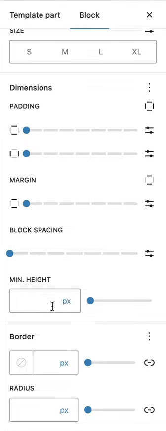
If enabled, additional settings will become available for blocks: margins, paddings, border-radius.
"settings": {
	"appearanceTools": true
}
This is equivalent to enabling the following parameters:
"settings": {
	"border": {
		"color": true,
		"radius": true,
		"style": true,
		"width": true
	},
	"color": {
		"link": true
	},
	"dimensions": {
		"minHeight": true
	},
	"position": {
		"sticky": true
	},
	"spacing": {
		"blockGap": true,
		"margin": true,
		"padding": true
	},
	"typography": {
		"lineHeight": true
	}
}
You can override individual parameters, for example:
"appearanceTools": true,
"position": {
  "sticky": false
}
Disadvantages:
- In the future WordPress may automatically enable new features, which may be undesirable for custom themes.
Conclusion:
- For public themes — convenient; you can enable it.
- For client projects — better to avoid it so that unnecessary settings do not appear.
background
Controls the ability to add background images and their settings in the block editor. With WP 6.3.
By default, disabled:
{
  "settings": {
	"background": {
	  "backgroundImage": false,
	  "backgroundSize": false
	}
  }
}
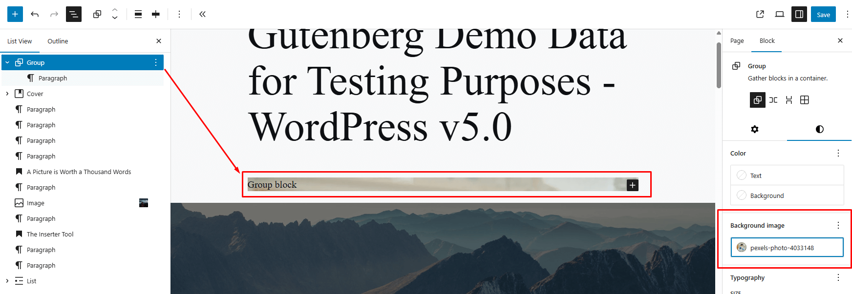
If enabled, the user will be able to set a background image via the editor. Enabling these parameters will enable the corresponding UI controls in blocks that support backgrounds (for example, Cover, Group).
- backgroundImage(bool)
Allows the user to add a background image.
Default: false
- backgroundSize(bool)
Enables the UI to manage background image parameters.
After selecting an image, you can click on it and you will see a pop-up menu with the ability to specify background image settings:

Which parameters can be configured:
- Set the image focus point: drag the marker or enter Left/Top coordinates in %.
- Enable/disable fixed background (parallax scroll).
- Choose a scaling mode: Cover, Contain, or Tile.
- Specify a custom width (Auto / px).
-
Enable/disable image repeating (Repeat).
Default: false
border
Allows managing global border (border) settings for blocks. Affects the availability of settings in the interface, not the border styles themselves.
By default: false:
{
	"settings": {
		"border": {
			"color": false,
			"style": false,
			"width": false,
			"radius": false,
			"radiusSizes": []
		}
	}
}
Each of the settings corresponds to a specific control element, allowing you to enable or disable a given capability by setting true or false:
color: enables/disables selecting the border color.style: enables/disables selecting the border style (solid, dashed, dotted).width: enables/disables entering the border width.radius: enables/disables selecting the corner rounding radius.radiusSizes: Presets for selecting border radius in format:[ { name, slug, size } ]

With WP 6.3, the properties color, style, and width are linked: if one of them is set to true, the others also become available in the interface.
Setting radius: false does not work for the button block.
color
Settings related to colors: managing palettes, duotones, gradients.
Color field structure:
{
  "settings": {
	"color": {
	  "text": true,
	  "link": true,
	  "background": true,

	  "custom": true,
	  "customGradient": true,
	  "customDuotone": true,

	  "defaultPalette": true,
	  "defaultGradients": true,
	  "defaultDuotone": true,

	  "palette": [],
	  "gradients": []
	  "duotone": [],
	}
  }
}
- text (bool)
- link (bool)
- background (bool)
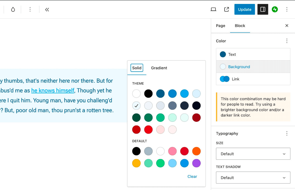
Text, background, and link color settings. They control showing/hiding UI elements.
These settings will be available only if the block supports them.
Default: all true
"settings": {
	"color": {
		"background": true,
		"link": true,
		"text": true
	}
}
Some blocks (including third-party blocks) may have their own non-standard color settings that are not controlled via
theme.json.- custom(bool)
Enables the ability to set arbitrary colors using a color picker.
If you disable this, it will still remain possible to add arbitrary colors to the palette via Site Editor > Styles.
Default: all true
"settings": {
	"color": {
		"custom": true
	}
}
This setting is useful when you want to preserve a defined color system — for example, in a client project.
- defaultPalette(bool)
Enables/disables the standard color palette presets that WordPress provides out of the box.
Default: true:
"settings": {
	"color": {
		"defaultPalette": true
	}
}
If you disable this option, WP will still create CSS variables for its standard presets. This is done for backward compatibility: if previously another theme was used where such presets were enabled.
WordPress by default provides a built-in color palette if the theme does not explicitly disable it. It includes the following predefined colors:
Color name Slug HEX code Black black #000000 Cyan bluish gray cyan-bluish-gray #abb8c3 White white #ffffff Pale pink pale-pink #f78da7 Vivid red vivid-red #cf2e2e Luminous vivid orange luminous-vivid-orange #ff6900 Luminous vivid amber luminous-vivid-amber #fcb900 Light green cyan light-green-cyan #7bdcb5 Vivid green cyan vivid-green-cyan #00d084 Pale cyan blue pale-cyan-blue #8ed1fc Vivid cyan blue vivid-cyan-blue #0693e3 Vivid purple vivid-purple #9b51e0 These colors are available in selection for text, backgrounds, links, and other block color settings.
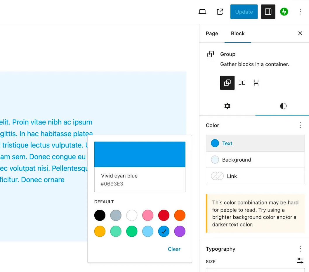
WordPress’ built-in palette is automatically converted into a set of CSS variables and classes.
CSS variables:
--wp--preset--color--{slug}--wp--preset--color--vivid-red: #cf2e2e;
CSS classes:
.has-{slug}-color            /* for text */
.has-{slug}-background-color /* for background */
.has-{slug}-border-color     /* if supported */
.has-vivid-red-color { color: var(--wp--preset--color--vivid-red); } .has-vivid-red-background-color { background-color: var(--wp--preset--color--vivid-red); } .has-vivid-red-border-color { border-color: var(--wp--preset--color--vivid-red); }See the current data in the code of the file /wp-includes/theme.json
- palette(array)
Allows you to set your own color palette — it will replace the default one. You can create any number of colors.
Each color is defined by an object with three required properties:
color— CSS color value. For example#ffffffor a CSS variable.name— name displayed in the interface.slug— unique ID (for generating CSS variables and classes).
Example for registering three colors:
{
  "version": 3,
  "settings": {
	  "color": {
		  "palette": [
			  { "name": "Base",     "slug": "base",     "color": "#ffffff" },
			  { "name": "Contrast", "slug": "contrast", "color": "#000000" },
			  { "name": "Primary",  "slug": "primary",  "color": "#89CFF0" }
		  ]
	  }
  }
}
We will get:
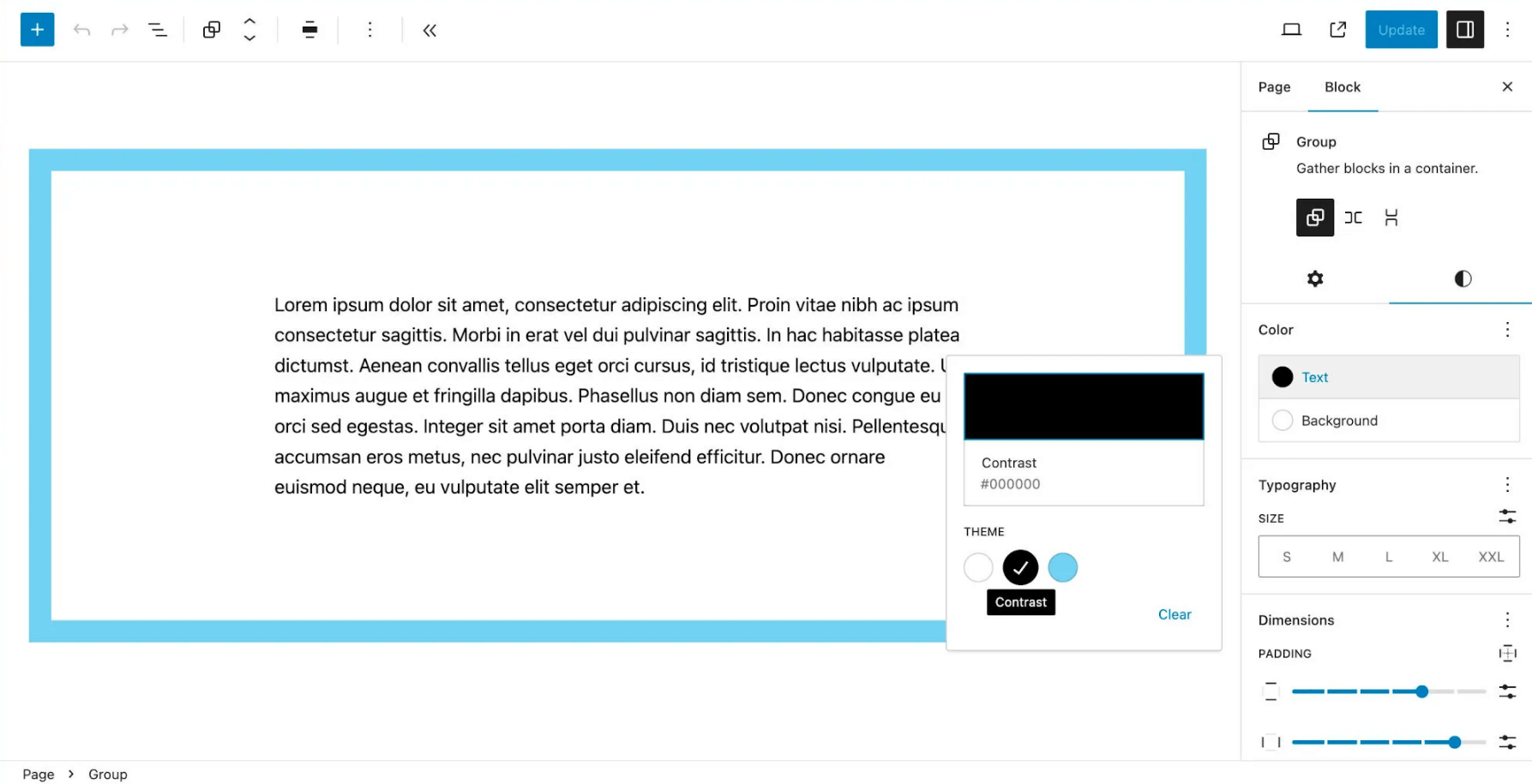
WordPress will automatically create a CSS variable for each preset.
// Format:
--wp--preset--color--{slug}

// Examples:
--wp--preset--color--base
--wp--preset--color--contrast
--wp--preset--color--primary
Also for each color, CSS variables and CSS classes will be generated. For example for the color
base:--wp--preset--color--base— CSS variable available on the front end and in the admin..has-base-color— CSS class — applied to text..has-base-background-color— CSS class — applied to the background.
Naming
There is no official color naming scheme in WordPress. However, two names have become de-facto standards, introduced by the “Twenty Twenty-Three” theme:base— for the site background color.contrast— for the main text.
Why this is needed:
- improves compatibility between themes.
- gives plugins predictable default colors (fallbacks).
- makes the theme more resilient to future changes in WordPress.
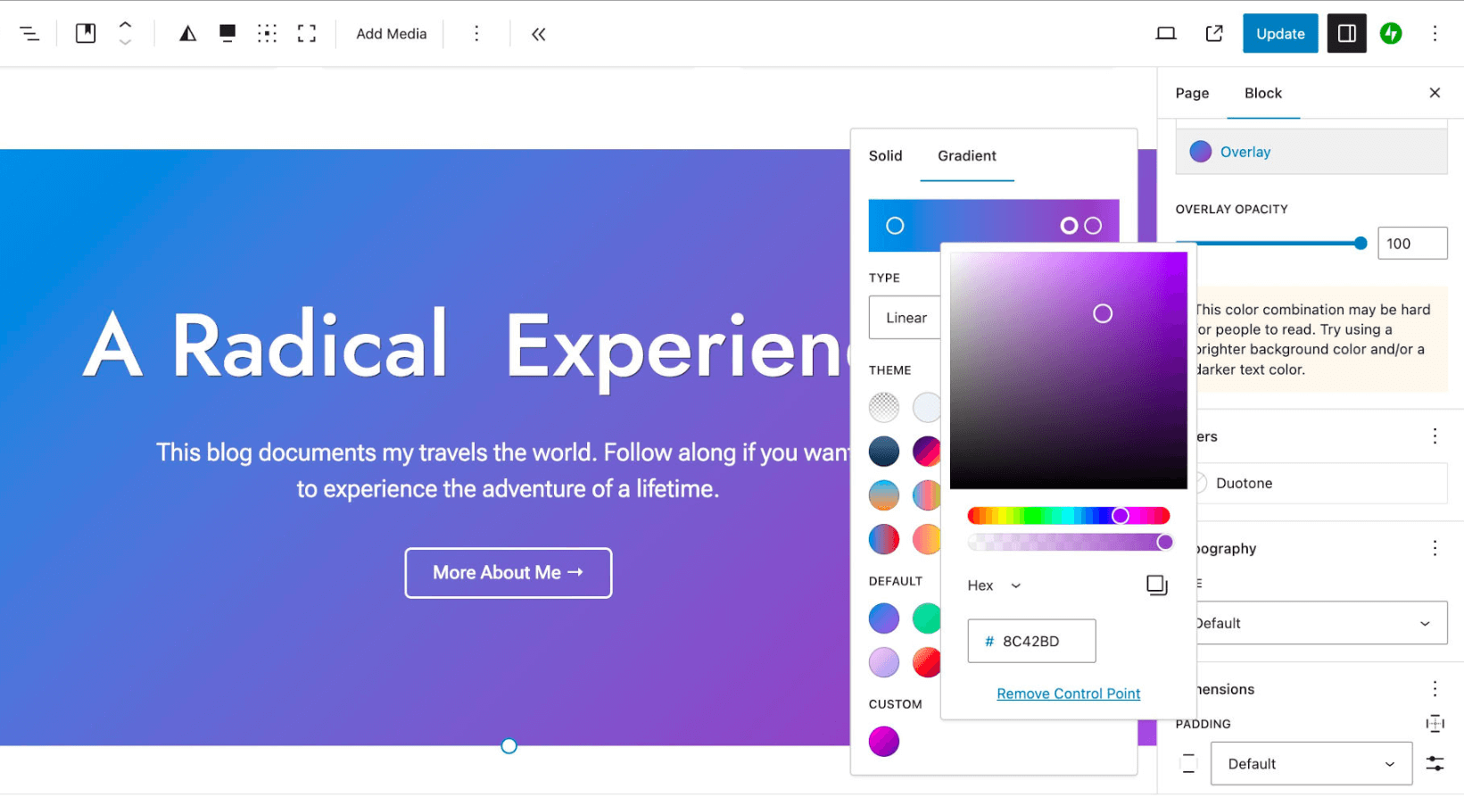
- customGradient(bool)
Allows setting arbitrary gradients, not limited to the theme’s preset gradients.
Default (true) — users can create their own gradients and apply them to the backgrounds of blocks that support this (for example, Cover).
Default: all true
"settings": {
	"color": {
		"customGradient": true
	}
}
- defaultGradients(bool)
Enables/disables gradient presets provided by WordPress by default.
Default: true:
"settings": {
	"color": {
		"defaultGradients": true
	}
}
If you disable this option, WP will still create CSS variables for its standard presets. This is done for backward compatibility: if previously another theme was used where such presets were enabled.
By default, WordPress offers a set of built-in gradients that can be used in blocks that support background gradients. Here is the list of available presets:
Gradient name Slug Example Vivid cyan blue to vivid purple vivid-cyan-blue-to-vivid-purple Light green cyan to vivid green cyan light-green-cyan-to-vivid-green-cyan Luminous vivid amber to luminous vivid orange luminous-vivid-amber-to-luminous-vivid-orange Luminous vivid orange to vivid red luminous-vivid-orange-to-vivid-red Very light gray to cyan bluish gray very-light-gray-to-cyan-bluish-gray Cool to warm spectrum cool-to-warm-spectrum Blush light purple blush-light-purple Blush bordeaux blush-bordeaux Luminous dusk luminous-dusk Pale ocean pale-ocean Electric grass electric-grass Midnight midnight They are displayed in the editor interface in the “Background > Gradient” section if the block supports this setting.
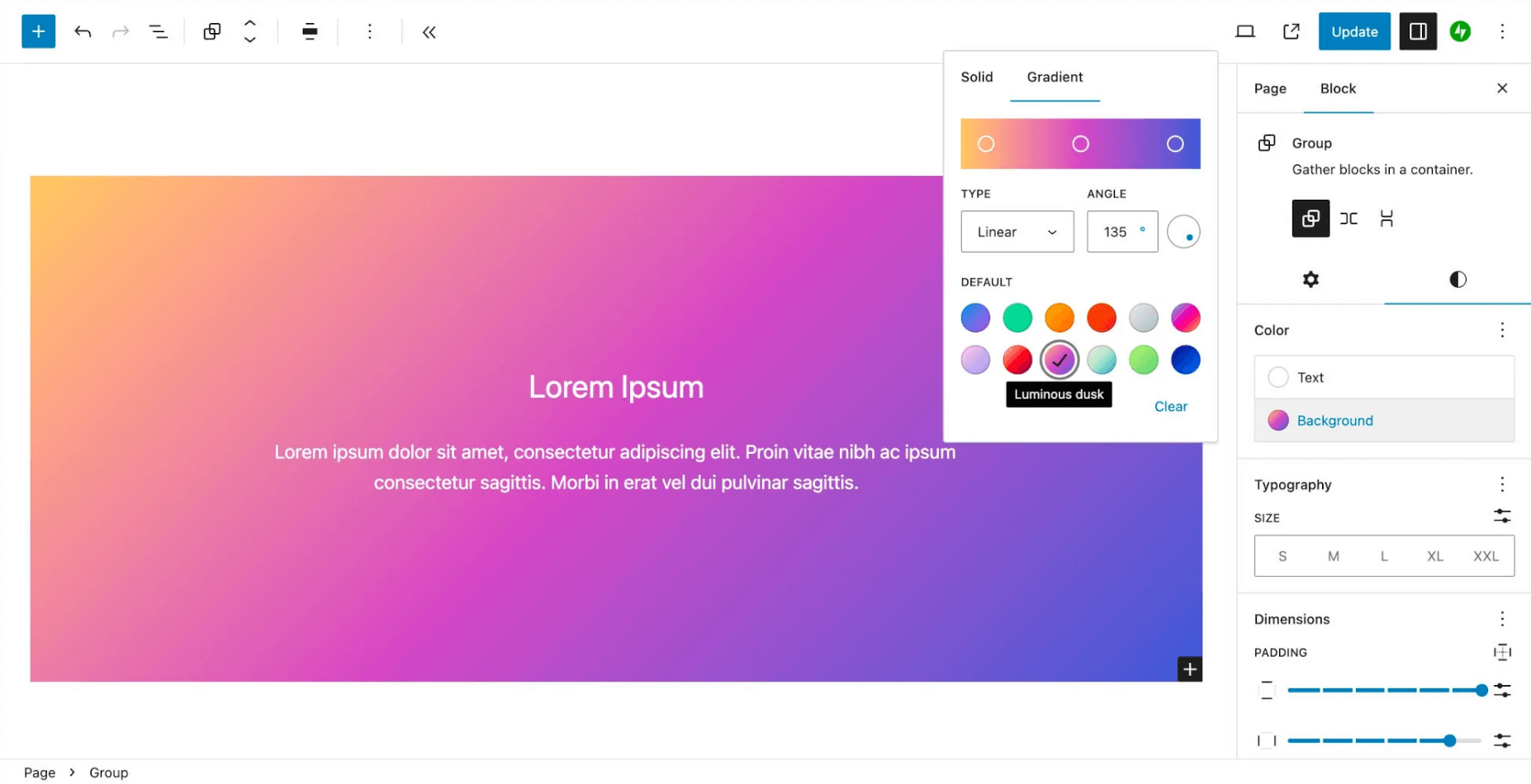
See the current data in the code of the file /wp-includes/theme.json
- gradients(array)
Allow registering custom gradient presets. You can add as many gradients as you want — there are no limits.
Each gradient is defined by an object with three fields:
gradient— CSS value (for example,linear-gradient(...)).name— name (displayed to the user).slug— unique ID (for CSS variables and classes).
Example for registering two gradients:
"settings": {
  "color": {
	  "gradients": [
		  {
			  "gradient": "linear-gradient(to right, #10b981, #64a30d)",
			  "name": "Emerald",
			  "slug": "emerald"
		  },
		  {
			  "gradient": "linear-gradient(-225deg,#231557,#44107a 29%,#ff1361 67%,#fff800)",
			  "name": "Fabled Sunset",
			  "slug": "fabled-sunset"
		  }
	  ]
  }
}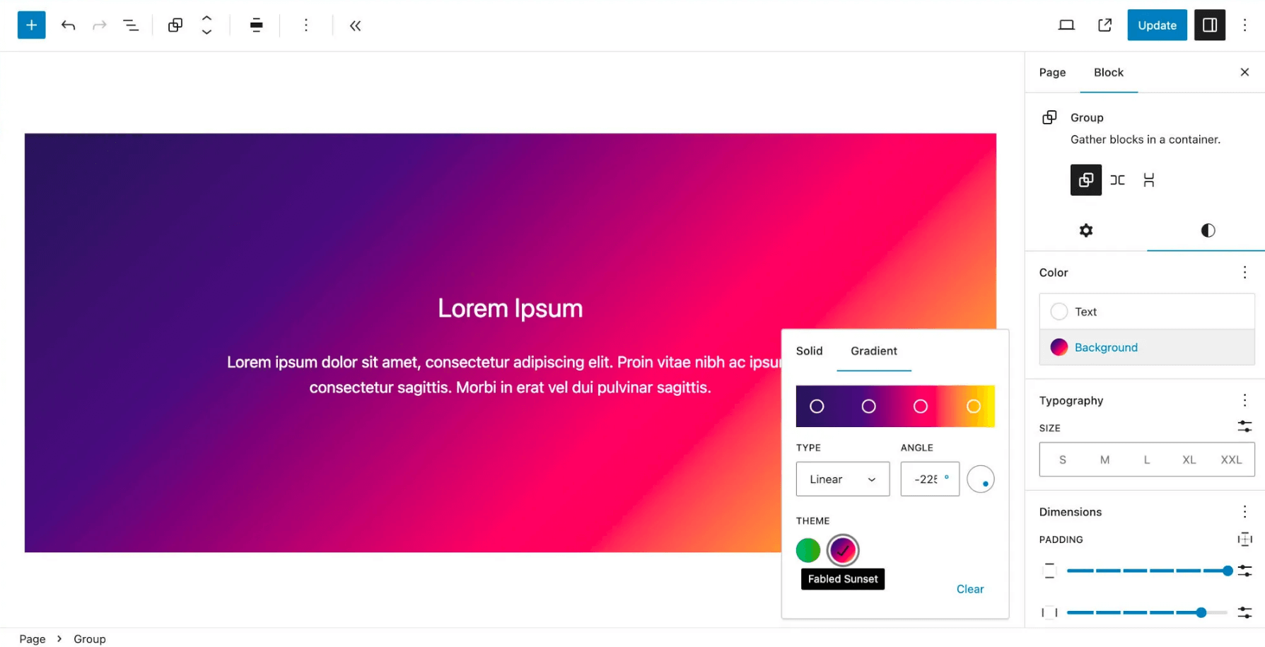
After registration:
- gradients appear in the block editor (in the color panel — “Background → Gradient”).
- CSS variables are automatically created:
// Format: --wp--preset--gradient--{slug} // Examples: --wp--preset--gradient--emerald --wp--preset--gradient--fabled-sunset - CSS classes are created:
.has-emerald-background { ... }
.has-fabled-sunset-background { ... }
- customDuotone (bool)
Allows the user to set arbitrary duotone filters (overlay effects of two colors).
Duotone (duotone) is applied as a color filter on top of images (or other media), creating an effect of overlaying two colors: shadow and light. Implemented via the css property
filter:#svg_id(an svg filter is generated by an admin script).This effect is supported by blocks that display images. The user can choose two colors — for shadow (shadow) and for light (highlight).
Default: all true
"settings": {
	"color": {
		"customDuotone": true
	}
}
- defaultDuotone (bool)
Enables/disables duotone filter presets provided by WordPress out of the box.
Default: true:
"settings": {
	"color": {
		"defaultGradients": true
	}
}
If you disable this option, WP will still create CSS variables for its standard presets. This is done for backward compatibility: if previously another theme was used where such presets were enabled.
WordPress provides several built-in duotone filters that are displayed in blocks that support duotone (usually — images and videos). These filters are applied as an overlay of two colors: shadow and light:
Filter name Slug Colors (shadow / light) Dark grayscale dark-grayscale #000000 / #7f7f7f Grayscale grayscale #000000 / #ffffff Purple and yellow purple-yellow #8c00b7 / #fcff41 Blue and red blue-red #000097 / #ff4747 Midnight midnight #000000 / #00a5ff Magenta and yellow magenta-yellow #c7005a / #fff278 Purple and green purple-green #a60072 / #67ff66 Blue and orange blue-orange #1900d8 / #ffa96b 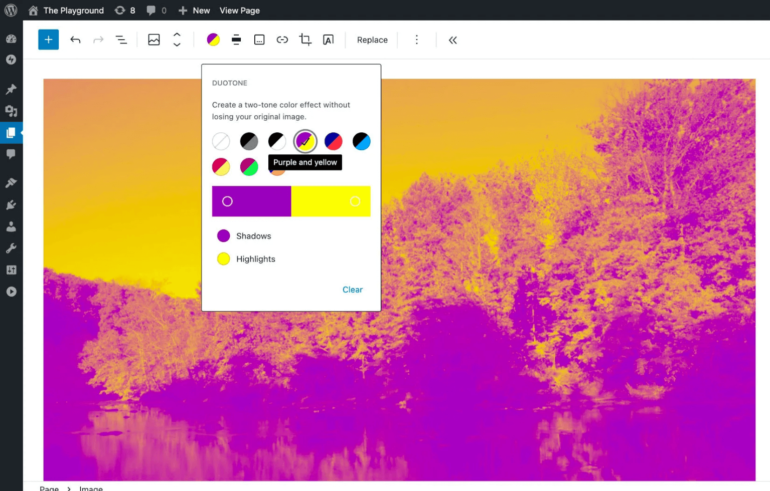
See the current data in the code of the file /wp-includes/theme.json
- duotone(array)
Allows registering custom duotone filter presets (image overlays) that the user can apply to images and other blocks that support duotone.
Each duotone filter is defined by an object with 3 fields:
-
colors— an array of two CSS colors (shadow and light).Only
hexorrgbstrings are supported. If you specify a variable value, we will get such a message:Function WP_Duotone::get_filter_svg() was called incorrectly.
var(--var-base)in theme.jsonsettings.color.duotoneis not a hex or rgb string. -
name— name displayed to the user. slug— unique identifier (used for classes).
Example for registering two duotone presets:
"settings": {
  "color": {
	  "duotone": [
		  {
			  "colors": [ "#450a0a", "#fef2f2" ],
			  "name": "Red",
			  "slug": "red"
		  },
		  {
			  "colors": [ "#172554", "#eff6ff" ],
			  "name": "Blue",
			  "slug": "blue"
		  }
	  ]
  }
}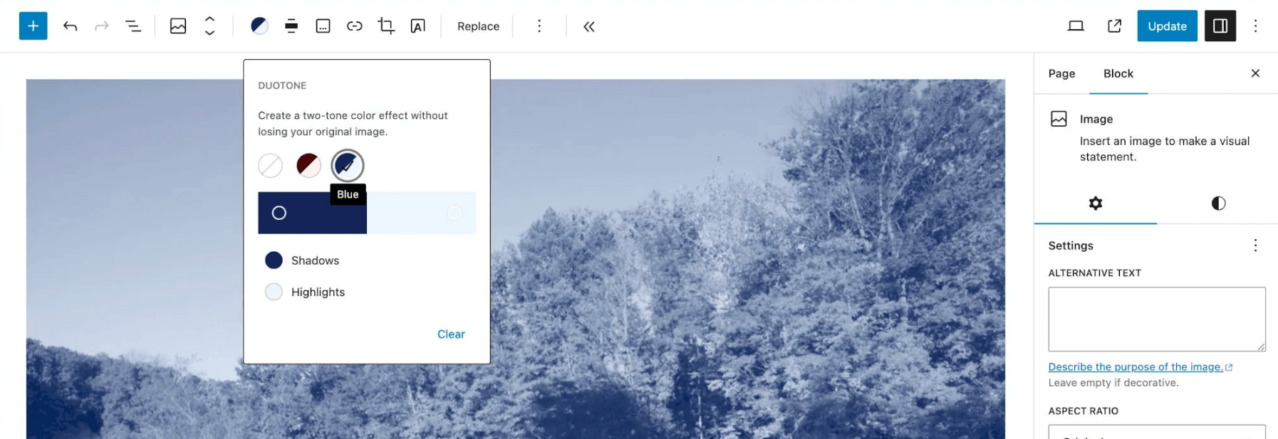
After registration:
-
WordPress will automatically create CSS variables for each preset.
// Format: --wp--preset--duotone--{slug} // Examples: --wp--preset--color--red --wp--preset--color--blue - CSS classes are created:
.has-red-background { ... }
.has-blue-background { ... }
-
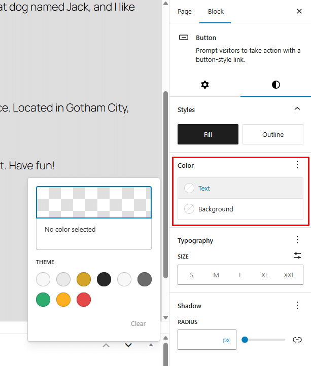
Enables UI controls for selecting the text and background color for the Button block (core/button).
false— the user will not be able to change the button color.Default: true.
- caption(bool)
Adds UI controls for changing caption text color.
false— the color will be only the default; the user will not be able to change it.Default: true.
- heading(bool)
Allows setting colors for headings (h1–h6) inside blocks.
Enables selecting the text color for headings in blocks such as:
core/heading,core/post-title.false— the editor will not show a palette for headings; only the theme style will be used.Default: true.
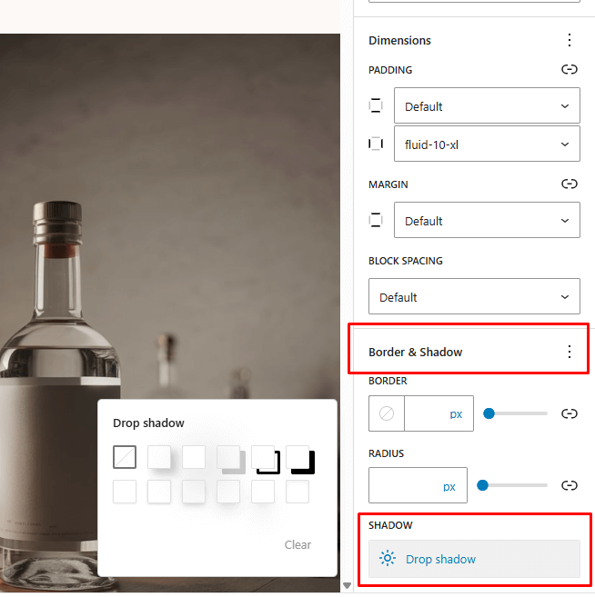
shadow
Manages shadow presets (box-shadow). Does not relate to text-shadow.
Parameters:
- defaultPresets(true|false)
- Turn on/off WordPress’ standard shadow presets.
Default:true. - presets(array)
- List of custom shadow presets.
For each preset, a variable is created:
--wp--preset--shadow--{slug}
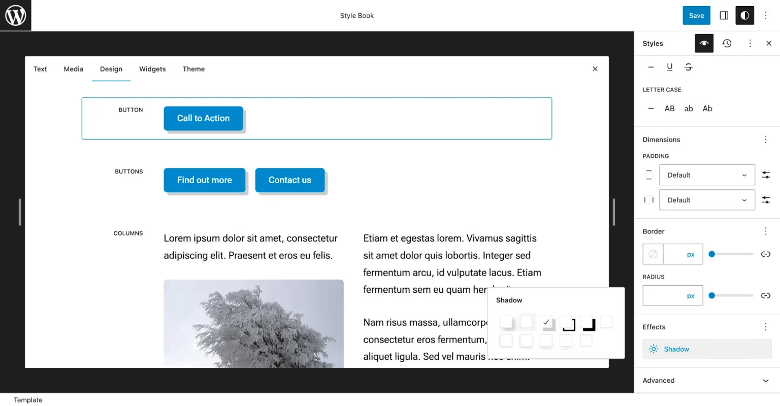
WordPress standard presets (when defaultPresets: true):
natural: 6px 6px 9px rgba(0,0,0,0.2)deep: 12px 12px 50px rgba(0,0,0,0.4)sharp: 6px 6px 0 rgba(0,0,0,0.2)outlined: 6px 6px 0 -3px rgba(255,255,255,1), 6px 6px rgba(0,0,0,1)crisp: 6px 6px 0 rgba(0,0,0,1)
Example: Disable standard shadows:
{
  "settings": {
	"shadow": {
	  "defaultPresets": false
	}
  }
}
Example: Add your own shadows
{
  "settings": {
	"shadow": {
	  "defaultPresets": false,
	  "presets": [
		{ "name": "Small",  "slug": "sm",
			"shadow": "0 1px 2px 0 rgb(0 0 0 / 0.05)" },
		{ "name": "Medium", "slug": "md",
			"shadow": "0 1px 3px 0 rgb(0 0 0 / 0.1), 0 1px 2px -1px rgb(0 0 0 / 0.1)" },
		{ "name": "Large",  "slug": "lg",
			"shadow": "0 4px 6px -1px rgb(0 0 0 / 0.1), 0 2px 4px -2px rgb(0 0 0 / 0.1)" },
		{ "name": "XL",     "slug": "xl",
			"shadow": "0 10px 15px -3px rgb(0 0 0 / 0.1), 0 4px 6px -4px rgb(0 0 0 / 0.1)" },
		{ "name": "2XL",    "slug": "2-xl",
			"shadow": "0 20px 25px -5px rgb(0 0 0 / 0.1), 0 8px 10px -6px rgb(0 0 0 / 0.1)" },
		{ "name": "Inner",  "slug": "inner",
			"shadow": "inset 0 2px 4px 0 rgb(0 0 0 / 0.05)" }
	  ]
	}
  }
}
Application:
-
In the admin: Appearance → Editor → Styles → Style Book → Button → Effects → Shadow.
- In code:
box-shadow: var(--wp--preset--shadow--sm).
dimensions
Allows you to manage global size settings for blocks.
Allows you to define which size controls will be available in the UI.
As of (WP 6.8), there is only one property — minHeight.
By default:
{
	"version": 3,
	"settings": {
		"dimensions": {
			"minHeight": false,
			"width": false,
			"aspectRatio": false,
			"aspectRatios": [],
			"defaultAspectRatios": true
		}
	}
}
- minHeight(bool)
Determines whether the “Minimum height” setting should be shown for blocks that support this feature.
Specify
trueto enable support for this control element:"settings": { "dimensions": { "minHeight": true } }We will get:
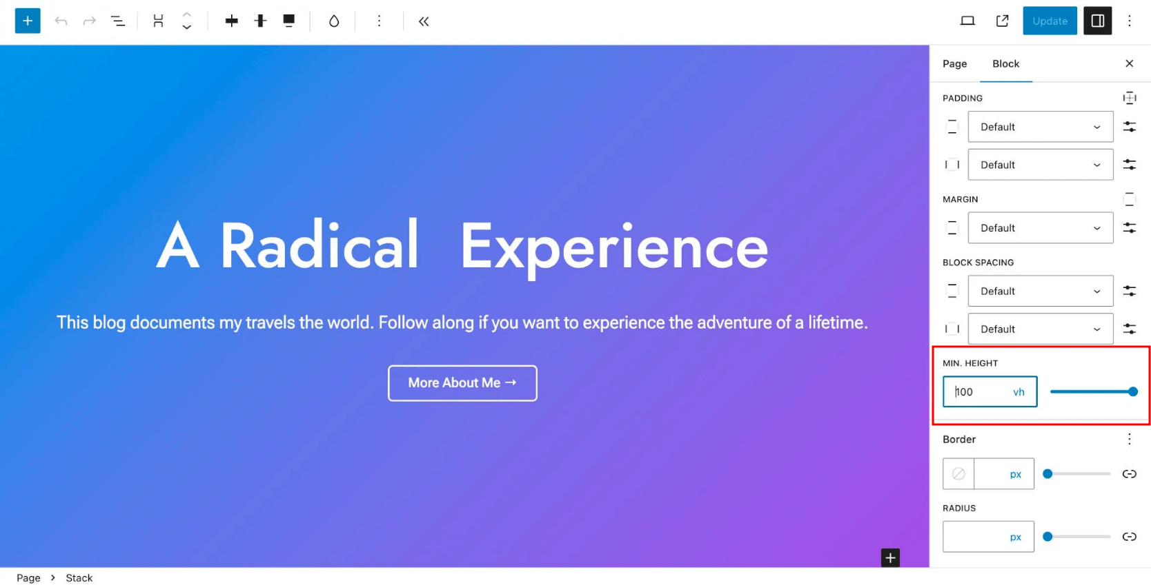
Built-in blocks that support the “minHeight” option — Group and Post Content. Valid for WP 6.3.
- width(bool)
Allow users to set custom width.
Default: false
- aspectRatio(bool)
Allow users to set an aspect ratio.
Default: false
- aspectRatios
Allow users to define aspect ratios for some blocks.
Default: []
- defaultAspectRatios(bool)
Allow users to choose aspect ratios from the default set of aspect ratios.
Default: true
- dimensionSizes(array) (WP 7.0)
Global set of ready sizes for
width/height.It sets the size presets for Width and Height controls in the Dimensions panel. That means the user can select a preset value instead of manual input.
Each preset has 3 fields:
name- name in the UIslug- system namesize- CSS size value:px,%,rem,vw,vh, etc.
{
	"settings": {
		"dimensions": {
			"dimensionSizes": [
				{
					"name": "Small",
					"slug": "small",
					"size": "240px"
				},
				{
					"name": "Medium",
					"slug": "medium",
					"size": "480px"
				},
				{
					"name": "Large",
					"slug": "large",
					"size": "720px"
				}
			]
		}
	}
}
WordPress creates CSS variables like this:
--wp--preset--dimension-size--small
--wp--preset--dimension-size--medium
--wp--preset--dimension-size--large
If fewer than 8 presets are set, a slider is shown in the UI. If 8 or more — a dropdown.
The user can still enter a custom value manually.
Important: for these presets to actually be visible in the block, the block itself must support the corresponding control, for example:
{
	"supports": {
		"dimensions": {
			"width": true,
			"height": true
		}
	}
}
layout
Settings related to basic display settings (layout). Responsible for the content width and “wide” blocks in your theme. This is needed to control the horizontal size of blocks.
Default: not specified
{
  "version": 3,
  "settings": {
	"layout": {
	  "contentSize": "40rem",
	  "wideSize": "64rem"
	}
  }
}
- contentSize(string)
Sets the base content width (for example, text width in a post). Supports
px,em,rem,vw,%. You can go beyond this size by setting the block width to “wide” or “full”.Applied to nested blocks inside
Post Content,Group, etc., if the option “Inner blocks use content width” is enabled for them.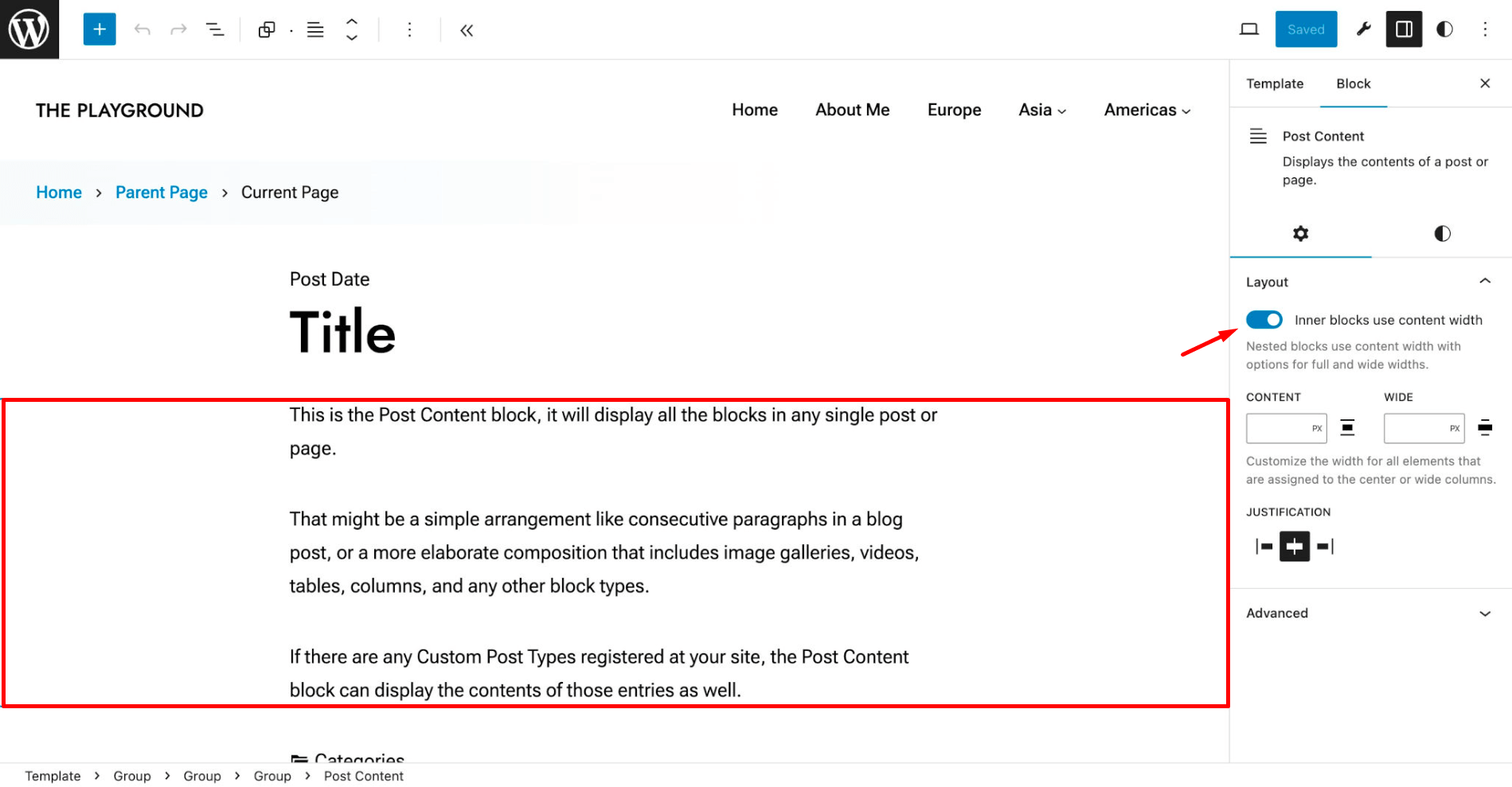
In most cases, it’s worth limiting the content width to a comfortable reading width — usually 45–75 characters per line (usually 40–50rem). The font and its size also affect this.
This value is used as a width limit for most blocks.
- wideSize(string)
Sets the width for blocks aligned with “wide” (
.alignwide). Supportspx,em,rem,vw,%.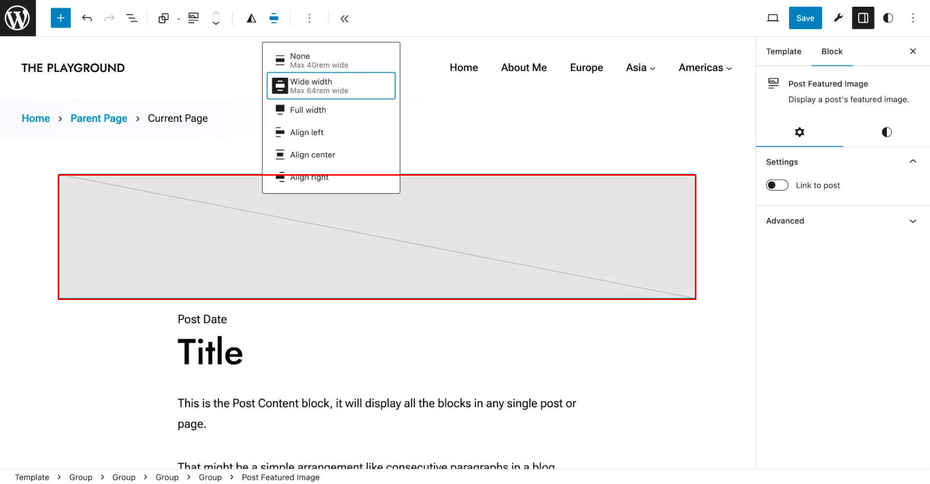
Needed when the design allows blocks to be wider than the main width (contentSize), but not the full width of the screen. As a rule, it’s located between the width of contentSize and the full screen width.
wideSize is active only if the block is placed inside a container with
contentSize.If
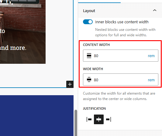
wideSizeis not specified, blocks with “wide” alignment may behave unpredictably. If your design is narrow and does not assume wide blocks, you can omit this value.- allowCustomContentAndWideSize (bool)
Enables UI controls to manually set content width sizes and alignWide elements.
Default: true
"settings": {
  "layout": {
	"allowCustomContentAndWideSize": true
  }
}
- allowEditing (bool)
Controls whether the layout settings can be edited at all via the UI editor.
Default: true
"settings": {
  "layout": {
	"allowEditing ": true
  }
}
If you set
false, this UI will completely disappear: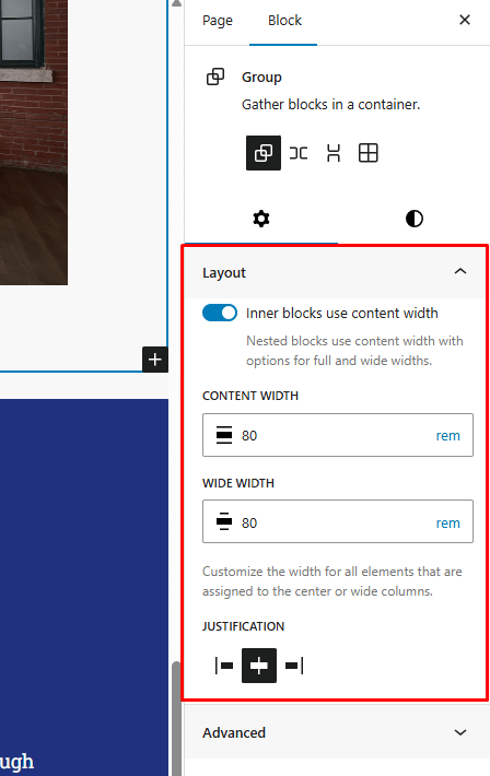
spacing
Indents. Default set of parameters:
"spacing": {
	"units": [ "rem", "em", "%", "vh", "vw" ],
	"blockGap": false,
	"customSpacingSize": true,
	"margin": false,
	"padding": false,
	"spacingScale": {
		"increment": 1.5,
		"mediumStep": 1.5,
		"operator": "*",
		"steps": 7,
		"unit": "rem"
	},
	"spacingSizes": [
		{
			"name": "",
			"size": "",
			"slug": ""
		}
	]
}
- units(array)
Specifies which units of measurement can be used when selecting a size:
"units": [
  "rem",
  "em",
  "%",
  "vh",
  "vw",
  "dvh",
  "lvh",
  "svh",
  "vmin",
  "vmax",
  "px"
]
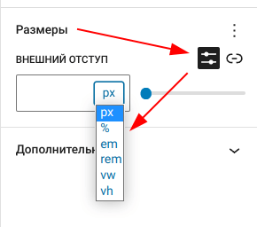
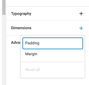
- padding (bool)
- margin (bool)
Enables/disables in the UI the ability to specify indents. Default: true
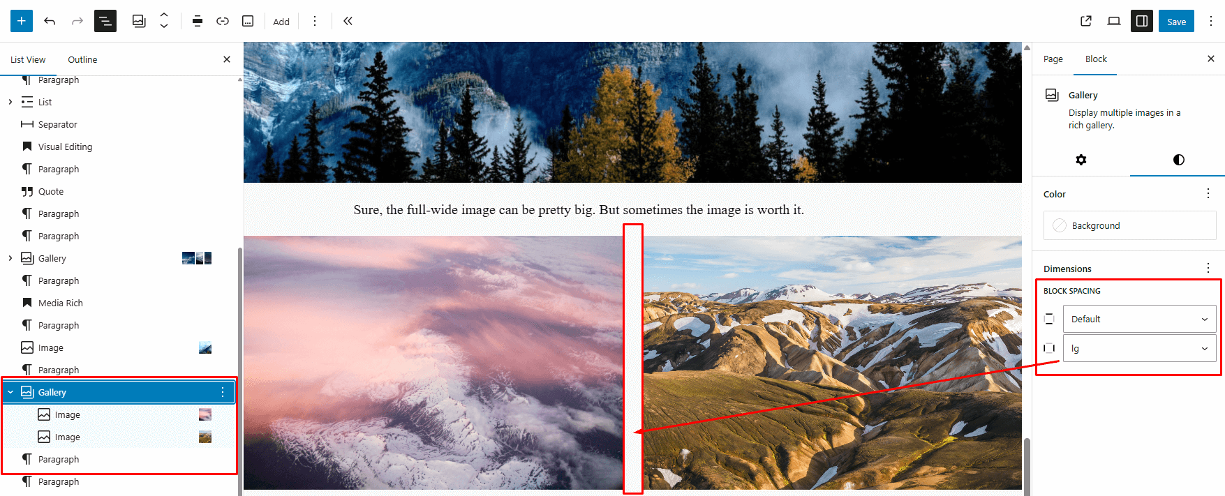
- blockGap(bool/null)
Enables/disables in the UI the ability to set spacing between blocks or flex/grid elements, for blocks that support it.
- In flow layouts (default) — the indent is applied via the CSS property
margin-topto neighboring elements. - In flex/grid layouts — applies the CSS property
gap.
Possible values:
null— disables the UI and CSS auto-generation — spacing will need to be set manually using custom CSS.true— enables UI and CSS style auto-generation.false— disables the UI interface, but leaves automatically generated CSS indents between blocks, for example:
Example of generated CSS:
.wp-container-17.wp-container-17 > :first-child:first-child {
  margin-block-start: 0;
}

.wp-container-17.wp-container-17 > * {
  margin-block-start: var(--wp--preset--spacing--plus-4);
  margin-block-end: 0;
}
The ID (
17) and the variable value will differ in each case.- In flow layouts (default) — the indent is applied via the CSS property
- spacingSizes(array)
A set of spacing presets for padding, margins, and gaps in the editor.
"settings": {
"spacing": {
  "spacingSizes": [
	{ "slug": "xs", "name": "XS", "size": "0.25rem" },
	{ "slug": "sm", "name": "S",  "size": "0.5rem" },
	{ "slug": "md", "name": "M",  "size": "1rem" },
	{ "slug": "lg", "name": "L",  "size": "1.5rem" },
	{ "slug": "xl", "name": "XL", "size": "2rem "}
  ]
}
}
Where:
slug— Unique ID, used in CSS and classes (10, small, md).name— Name in the WordPress UI (can be translated).size— CSS value in rem, px, %, etc.
For each preset, WordPress generates a CSS variable and classes:
--wp--preset--spacing--{slug} .has-{slug}-margin .has-{slug}-padding .has-{slug}-gap- spacingScale(array)
Allows automatically generating a spacing scale (spacing) instead of manually setting each value. Simplifies managing spacing presets.
"spacingScale": {
"operator": "*",   // + or * — how the scale is built: by adding (+) or multiplying (*).
"increment": 1.5,  // number — step size increase between values.
"steps": 7,        // number — how many values to generate in the scale.
"mediumStep": 1.5, // number — medium value.
"unit": "rem"      // string — Units: rem, px, em, %, vw, etc..
}
To avoid generating such a scale, simply do not specify this field.
Example of logic
If you set:
{
  "operator": "*",
  "increment": 1.2,
  "steps": 10,
  "mediumStep": 1.5,
  "unit": "rem"
}
WordPress will generate approximately these steps (css variables), around mediumStep = 1.5:
--wp--preset--spacing--10  // 1.25rem
--wp--preset--spacing--20  // 1.5rem
--wp--preset--spacing--30  // 1.8rem
// etc.

- customSpacingSize (bool)
Allow users to set arbitrary indents (margin/padding/gap) for blocks that support them.

List of supported units:
px
%
em
rem
vw
vh
vmin
vmax
ch
ex
cm
mm
in
pc
pt
- defaultSpacingSizes (bool)
Determines whether WordPress will show built-in indent sizes (spacing presets) in the editor.
"settings": { "spacing": { "defaultSpacingSizes": true } }-
true — WordPress will show built-in spacing sizes (for example, Small, Medium, Large).
- false — built-in sizes will not be displayed; only the custom ones from spacingSizes will remain (if any).
Related parameters:
spacingSizes: your own sizes.spacingScale: auto-generation of the scale.customSpacingSize: allows entering values manually.
-
typography
Settings related to typography. Example of all parameters:
"typography": {
	"dropCap": false,
	"fluid": false,
	"letterSpacing": false,
	"lineHeight": false,
	"textDecoration": true,
	"textTransform": true,
	"customFontSize": true,
	"fontSizes": [
		{
			"size": "100%",
			"slug": "100%",
			"name": "",
			"fluid": {
				"max": "",
				"min": ""
			},

		}
	],
	"fontFamilies": [
		{
			"slug": "",
			"name": "",
			"fontFamily": "",
			"fontFace": [
				{
					"src": "",
					"ascentOverride": "",
					"descentOverride": "",
					"fontDisplay": "fallback",
					"fontFamily": "",
					"fontFeatureSettings": "",
					"fontStretch": "",
					"fontStyle": "",
					"fontVariant": "",
					"fontVariationSettings": "",
					"fontWeight": "400",
					"lineGapOverride": "",
					"sizeAdjust": "",
					"unicodeRange": ""
				}
			]
		}
	]
},
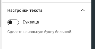
- dropCap (bool)
Drop cap. Default: true.
- fontStyle (bool)
_TODO_ Allow users to set custom font styles.
Default: true
- fontWeight (bool)
_TODO_ Allow users to set custom font weights.
Default: true
- letterSpacing (bool)
_TODO_ Allow users to set custom letter spacing.
Default: true
- lineHeight (bool)
Allows users to set an arbitrary line height size.
Default: false

- textAlign (bool)
_TODO_ Allow users to set the text align.
Default: true
- textColumns (bool)
_TODO_ Allow users to set the number of text columns.
Default: false
- textDecoration (bool)
_TODO_ Allow users to set custom text decorations.
Default: true
- textTransform (bool)
- _TODO_
- writingMode (bool)
_TODO_ Allow users to set the writing mode.
Default: false
- defaultFontSizes (bool)
_TODO_ Allow users to choose font sizes from the default font size presets.
Default: true
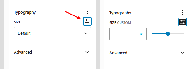
- customFontSize (bool)
Show UI for entering an arbitrary font-size value. Default: true.
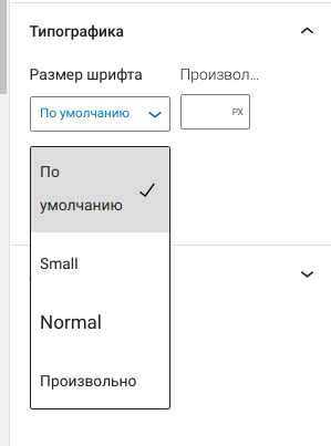
- fontSizes(array)
Sets a list of font sizes that can be selected in the editor.
"fontSizes": [
  {
	  "name": "Small",
	  "slug": "small",
	  "size": "13px"
  },
  {
	  "name": "Normal",
	  "slug": "normal",
	  "size": "16px"
  }
]
fluid parameter:
The
fluidparameter inside thefontSizesarray allows you to set a flexible (adaptive) font size that changes depending on the screen width.For example:
"fontSizes": [
  {
	  "name": "Small",
	  "slug": "sm",
	  "size": "2rem",
	  "fluid": true,
  },
  {
	  "name": "Medium",
	  "slug": "md",
	  "size": "3rem",
	  "fluid": { "min":"1rem", "max":"3rem" }
  },
]
Possible values of the fluid parameter:
- true — The specified size will be used as the maximum, and the minimums will be calculated automatically.
- false — Fluid typography will be disabled.
- object — Enables adaptation to the specified
{ min, max }sizes.
See more details in the settings.typography.fluid parameter, where you can also configure global parameters.
- fluid
Enables and allows specifying settings for adaptive font sizes (fluid typography) for all font sizes listed in
fontSizes."typography": { "fluid": { "minFontSize": "12px", "minViewportWidth": "375px", "maxViewportWidth": "1280px" } }Parameters:
-
true — Enables adaptive font sizes.
-
false — Disables adaptive font sizes. However, you can specify an adaptive size for an individual width size in fontSizes.
-
object — Parameters for calculating values in the clamp() function.
-
minFontSize — (px, rem) Lower bound of the possible font size. If the formula suggests a smaller size, this value will be used.
Default: 16px -
minViewportWidth — (px, rem) Minimum screen width starting from which the font will start increasing.
Default: 320px - maxViewportWidth — (px, rem) Maximum screen width up to which the font will stop increasing.
Default: 1280px
-
How it works:
If you specify fluid, WordPress will automatically generate the font size value as clamp():
--wp--preset--font-size--myslug: clamp( min, calc(...), max );
Example result:
clamp(2.364rem, 2.364rem + ((1vw - 0.2rem) * 3.497), 4.375rem);
Thanks to this, the size will scale smoothly between min and max when the window width changes.
How it’s calculated:
See the function wp_get_typography_font_size_value()
/**
 * Fluid indents calculation guide
 * ------------------------------
 * Step 1: Determine the 1vw value in rem for key breakpoints:
 *   Formula: vw_rem = (screen_width_px / 100) / root_font_size_px
 *   Example: (375 / 100) / 16 = 0.234rem
 *
 *   1vw values:
 *     375px  → 0.234rem
 *     576px  → 0.360rem
 *     768px  → 0.480rem
 *     1024px → 0.640rem
 *     1280px → 0.800rem
 *     1440px → 0.900rem
 *     1920px → 1.200rem
 *
 * Step 2: Calculate the slope for clamp():
 *   font_min   = 1rem  (16px)
 *   font_max   = 3rem  (48px)
 *   font_range = font_max - font_min
 *              = 3rem - 1rem = 2rem (32px)
 *
 *   vw_range   = 1vw(1440) - 1vw(768)
 *              = 0.900rem - 0.480rem = 0.420rem (6.72px)
 *
 *   slope      = font_range / vw_range
 *              = 2rem / 0.420rem = 4.761 (≈76.19px per 1vw change)
 *
 * Step 3: Final clamp() formula:
 *   clamp(
 *     font_min,                               // minimum for ≤768px
 *     font_min + ((1vw - 0.480rem) * slope),  // growth between 768px–1440px
 *     font_max                                // maximum for ≥1440px
 *   )
 *
 * Example (768→1440px, middle ~2rem):
 *   --fluid-space: clamp(1rem, 1rem + ((1vw - 0.480rem) * 4.761), 3rem);
 *   OR shorter (expand parentheses):
 *   --fluid-space: clamp(1rem, -1.285rem + 4.761vw, 3rem);
 */
Online service: https://clamp.font-size.app/
-
- fontFamilies(array)
Allows registering fonts that will be available in the block settings panel (if the block supports font selection) Typography → Font.
In the value, you need to pass an array of objects. Each object can have the following properties:
-
name(required)
Font name. Displayed when selected in settings. -
slug(required)
Slug (label).Used in a CSS variable:
--wp--preset--font-family--{slug}It is recommended to use a semantic name (
primary,secondary) so it does not depend on a specific font. -
fontFamily(required)
Value for the CSSfont-family. Usually a font stack:system-ui, sans-serif. -
fontFace
An array of objects. Each object describes@font-facedata. Everything specified in this parameter will be generated on the page.If you do not specify this parameter, it will mean that the fonts specified in
fontFamilyare system fonts.Each object can contain properties from the @font-face descriptor; here are some examples:
"fontFace": [
	{
		"fontFamily": "Open Sans",
		"fontWeight": "300 800",
		"fontStyle": "normal",
		"fontStretch": "normal",
		"fontDisplay": "swap"
		"src": [ "file:./assets/fonts/open-sans.woff2" ]
	},
	{
		"fontFamily": "",
		"fontWeight": "400",
		"fontStretch": "",
		"fontStyle": "",
		"fontVariant": "",
		"fontDisplay": "fallback",
		"src": "",
		"ascentOverride": "",
		"descentOverride": "",
		"fontFeatureSettings": "",
		"fontVariationSettings": "",
		"lineGapOverride": "",
		"sizeAdjust": "",
		"unicodeRange": ""
	}
]
The path in
srcmust be relative (file — WordPress will add the rest itself.
Usage:
- In theme.json
var:preset|font-family|{slug} - In CSS
var(--wp--preset--font-family--{slug})
Example: Add your own fonts
{
	"$schema": "https://schemas.wp.org/trunk/theme.json",
	"version": 3,
	"settings": {
		"typography": {
			"fontFamilies": [
				{
				  "name": "Basic",
				  "slug": "basic",
				  "fontFamily": "FuturaPT, sans-serif",
				  "fontFace": [
					{
					  "fontFamily": "FuturaPT",
					  "fontWeight": "400",
					  "fontStyle": "normal",
					  "fontDisplay": "swap",
					  "src": [ "file:./assets/fonts/FuturaPT-Book.woff2" ]
					}
				  ]
				},
				{
				  "name": "Headers",
				  "slug": "headers",
				  "fontFamily": "TTFors, sans-serif",
				  "fontFace": [
					{
					  "fontFamily": "TTFors",
					  "fontWeight": "400 500",
					  "fontStyle": "normal",
					  "fontDisplay": "swap",
					  "src": [ "file:./assets/fonts/TTFors-Medium.woff2" ]
					},
					{
					  "fontFamily": "TTFors",
					  "fontWeight": "600 800",
					  "fontStyle": "normal",
					  "fontDisplay": "swap",
					  "src": [ "file:./assets/fonts/TTFors-Bold.woff2" ]
					}
				  ]
				},
				{
				  "name": "Alt",
				  "slug": "alt",
				  "fontFamily": "BigNoodleTitling, serif",
				  "fontFace": [
					{
					  "fontFamily": "BigNoodleTitling",
					  "fontWeight": "300 700",
					  "fontStyle": "normal",
					  "src": [ "file:./assets/fonts/BigNoodleTitling.woff2" ]
					}
				  ]
				}
			  ]
			}
		}
	}
}
In the UI it will look like this:
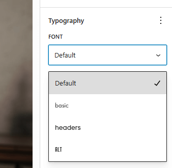
WordPress will create CSS variables:
--wp--preset--font-family--basic: FuturaPT, sans-serif;
--wp--preset--font-family--headers: TTFors, sans-serif;
--wp--preset--font-family--alt: BigNoodleTitling, serif;
It will create a CSS class:
.has-{slug}-font-familyAnd it will add the font registration to HTML:
<style class='wp-fonts-local'> @font-face { font-family: FuturaPT; font-style: normal; font-weight: 400; font-display: swap; src: url('http://example.loc/wp-content/themes/mytheme/assets/fonts/FuturaPT-Book.woff2') format('woff2'); } @font-face { font-family: TTFors; font-style: normal; font-weight: 400 500; font-display: swap; src: url('http://example.loc/wp-content/themes/mytheme/assets/fonts/TTFors-Medium.woff2') format('woff2'); } @font-face { font-family: TTFors; font-style: normal; font-weight: 600 800; font-display: swap; src: url('http://example.loc/wp-content/themes/mytheme/assets/fonts/TTFors-DemiBold.woff2') format('woff2'); } @font-face { font-family: BigNoodleTitling; font-style: normal; font-weight: 300 700; font-display: fallback; src: url('http://example.loc/wp-content/themes/mytheme/assets/fonts/BigNoodleTitling-Tracked.woff2') format('woff2'); } </style>-
lightbox
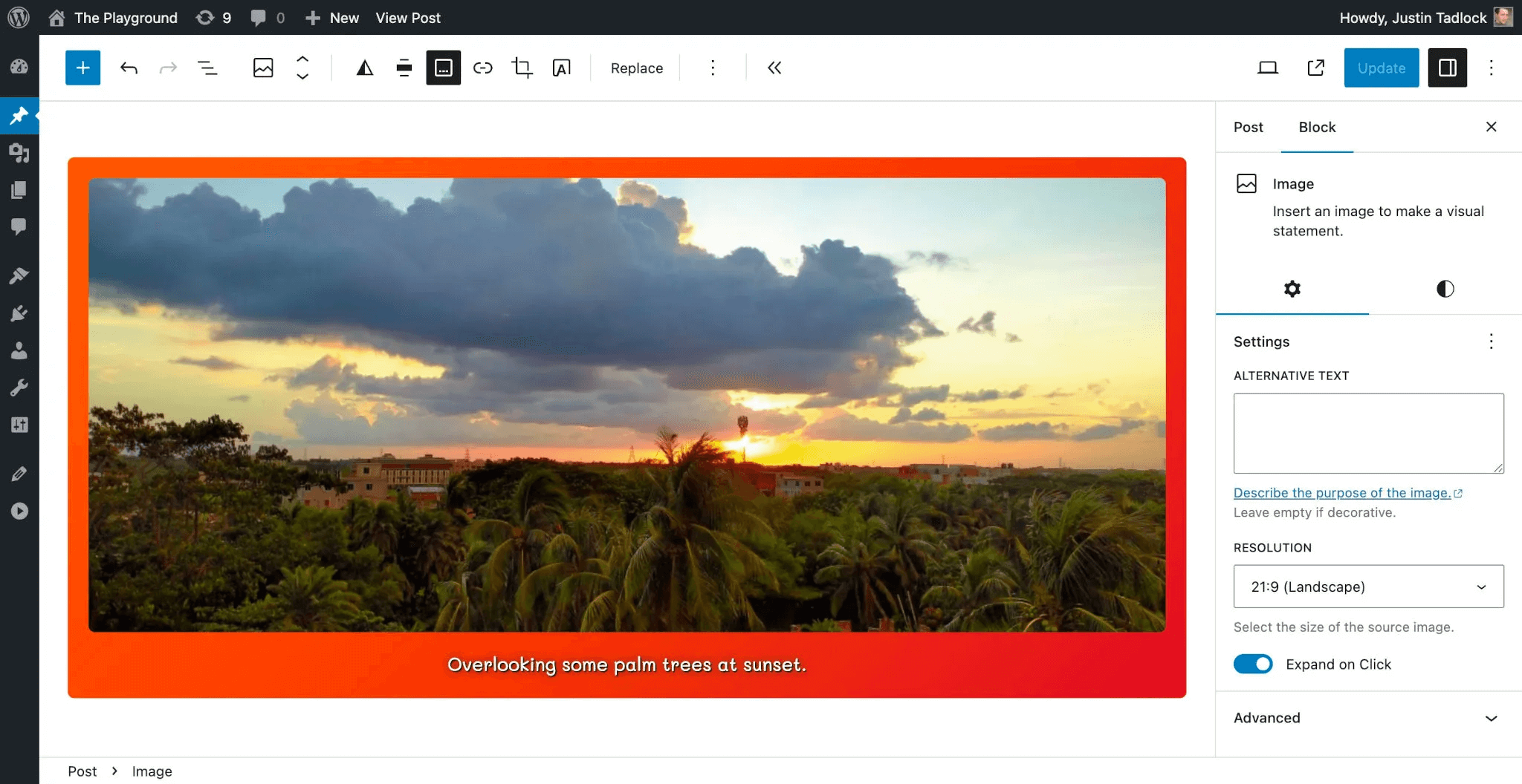
Enables the image enlargement on click (lightbox) feature for blocks that support it.
Available with WordPress 6.4 and only for the core/image block.
Parameters:
- enabled (true|false)
- Enables/disables lightbox for all images.
Default:false(disabled). - allowEditing (true|false)
Allows or disallows the user from enabling/disabling lightbox for a specific block via the interface.
When
true, the Image block editor will show the Expand on Click option.Default:
true.
Example: Enable lightbox for all images and prevent the user from changing the setting.
{
  "settings": {
	"blocks": {
	  "core/image": {
		"lightbox": {
		  "enabled": true,
		  "allowEditing": false
		}
	  }
	}
  }
}
position
Allows enabling/disabling support for “sticky” (Sticky) positioning for blocks that support this feature.
It only controls the availability of options in the interface, not CSS styles.
Parameters:
Example: Enable support for sticky positioning for blocks:
"settings": {
	"position": {
		"sticky": true
	}
}
After enabling, a Position option will appear in the block settings with variants: Default and Sticky:

Notes:
-
The feature works only for blocks that support
position(for example, Group). - A sticky header cannot be applied to the Header block directly using
sticky. Instead, wrap the header in a Group and setstickyfor that group.
custom
Allows creating custom CSS variables available in the theme. WordPress will automatically generate them from the specified keys and values.
Format of created variables:
--wp--custom--{key}: {value}
CamelCaseis converted tokebab-case. For example:lineHeight→line-height.- Numbers are separated with hyphens. For example:
abc123→abc-1-2-3.
Example:
"settings": {
	"custom": {
		"fruit": "apple"
	}
}
We will get in CSS:
body {
	--wp--custom--fruit: apple;
}
You can create nested objects for groups of variables:
{
	"settings": {
		"custom": {
			"lineHeight": {
				"xs": "1",
				"sm": "1.25",
				"md": "1.5",
				"lg": "1.75"
			}
		}
	}
}
Result:
body {
	--wp--custom--line-height--xs: 1;
	--wp--custom--line-height--sm: 1.25;
	--wp--custom--line-height--md: 1.5;
	--wp--custom--line-height--lg: 1.75;
}
Usage in other places in theme.json via var:custom|…:
{
	"version": 3,
	"settings": {
		"custom": {
			"lineHeight": {
				"xs": "1",
				"sm": "1.25",
				"md": "1.5",
				"lg": "1.75"
			}
		}
	},
	"styles": {
		"typography": {
			"lineHeight": "var:custom|line-height|md"
		},
		"blocks": {
			"core/paragraph": {
				"typography": {
					"lineHeight": "var:custom|line-height|lg"
				}
			}
		}
	}
}
Or in CSS directly:
.example-class {
	line-height: var(--wp--custom--line-height--sm);
}
useRootPaddingAwareAlignments (true|false)
Note: This property is only at the top level. Not available in blocks.
Controls where WP will add horizontal (left, right) paddings specified in styles.spacing.padding (not related to the editor UI).
- When
false(default) — applied to<body>. - When
true— applied to container blocks (for example, Group with constrained layout), not to<body>. This allows elements withfullwidth to stretch to the edges of the screen.
Example:
"settings": {
	"useRootPaddingAwareAlignments": true
},
"styles": {
	"spacing": {
	  "padding": {
		"top": "0",
		"bottom": "0",
		"left": "2rem",
		"right": "2rem"
	  }
	}
}
Vertical paddings (top, bottom) do not participate in this logic.
How it works when true
If settings.useRootPaddingAwareAlignments: true:
1) In <body>, CSS variables are added:
body {
  --wp--style--root--padding-left: 2rem;
  --wp--style--root--padding-right: 2rem;
}
2) A class has-global-padding is added to blocks:
<div class="wp-block-group has-global-padding is-layout-constrained">
3) Style properties are added to the styles:
.has-global-padding {
	padding-left: var(--wp--style--root--padding-left);
	padding-right: var(--wp--style--root--padding-right);
}
How it works when false
If settings.useRootPaddingAwareAlignments: false (or not specified):
- Horizontal indents from
styles.spacing.paddingare applied to<body>. - Container blocks (for example, Group) DO NOT receive the class
.has-global-padding. - Full-width blocks (full-width) do NOT go beyond the padding — they are constrained by the internal indents of
<body>. - Result: the whole site is visually squeezed inside the horizontal paddings.
blocks
Allows changing any property of any block, if that block supports the required setting.
To set settings for a block, you need to know its namespace/slug. For standard blocks it is core/block_name. For example: core/button, core/pullquote.
By default, theme.json settings apply globally — they are applied to all blocks that support them.
For example, global settings might look like this:
{
  "version": 3,
  "settings": {
	"border": {},
	"color": {},
	...
  }
}
But if you want a specific block (for example, Cover) to have its own colors or styles, you can override the global settings in settings.blocks.
Structure is the same as for global settings. Example:
- Globally:
settings.color - For a block:
settings.blocks["core/cover"].color
Example: a custom color palette for Cover
Global colors will be available in all blocks:
{
  "settings": {
	"color": {
	  "palette": [
		{ "color": "#0284c7", "name": "Base",     "slug": "base" },
		{ "color": "#ffffff", "name": "Contrast", "slug": "contrast" }
	  ]
	}
  }
}
Let’s specify separate colors for the Cover block:
{
  "settings": {
	"blocks": {
	  "core/cover": {
		"color": {
		  "palette": [
			{ "color": "#ea580c", "name": "Base",     "slug": "base" },
			{ "color": "#fff7ed", "name": "Contrast", "slug": "contrast" }
		  ]
		}
	  }
	}
  }
}
Attention, default block settings
Some global settings may not work for some blocks.
By default, WordPress enables some settings for blocks (for compatibility with older versions). For example:
{
  "settings": {
	"blocks": {
	  "core/button": {
		"border": { "radius": true }
	  },
	  "core/pullquote": {
		"border": {
		  "color": true,
		  "radius": true,
		  "style": true,
		  "width": true
		}
	  }
	}
  }
}
If global settings do not work for some blocks, they are likely overridden at the block level. To change the behavior, set your own values in settings.blocks.
styles
Allows configuring CSS styles in theme.json, for the body as a whole, for specific elements, and for individual blocks. Specifying styles this way will allow changing them through the admin page Appearance > Editor > Styles.
For the current list of supported parameters, see the constant WP_Theme_JSON::VALID_STYLES.
Styling is divided into three levels:
- Root (body)
- Elements
- Blocks
{
	"version": 3,
	"styles": {
		"color": {
			"text": "#000000",
			"background": "#ffffff"
		},
		"elements": {
			"button": {
				"color": {
					"text": "#ffffff",
					"background": "#000000"
				}
			}
		},
		"blocks": {
			"core/code": {
				"color": {
					"text": "#ffffff",
					"background": "#000000"
				}
			}
		}
	}
}
- Styles on the top level will be added to the
bodyselector. - Styles in “elements” will apply to the specified HTML elements.
- For blocks, styles will be applied to the blocks.
- Root styles (body styles)
Root element — the
<body>tag. Styles specified directly in “styles” will be applied to thebodyselector.Example of setting text and background color:
{
	"version": 3,
	"styles": {
		"color": {
			"text": "#000000",
			"background": "#f5f1ea"
		}
	}
}
This will produce CSS:
body {
	background: #f5f1ea;
	color: #000000;
}
These styles will be used by default everywhere where there is no more specific rule.
The root element supports almost all style properties described in settings.
The property
styles.spacing.paddinghas a special case when using settings.useRootPaddingAwareAlignments- elements
Section where you can set base styles for HTML elements (not blocks).
Everything declared here will be output by WordPress as CSS variables and rules applied to the corresponding HTML tags on the front end and in the editor.
Box-provided elements are supported:
button
link
heading
h1 h2 h3 h4 h5 h6
caption
cite
Which properties can be set:
Inside each element, the same set as instylesis allowed:colortypographyspacingbordershadowdimensions- Pseudo-selectors:
- :hover
- :focus
- :focus-visible
- :active
- :visited
For example:
"styles": {
	"elements": {
		"button": {
			"color": {
				"text": "#ffffff",
				"background": "#aa3f33"
			}
		}
	}
}
Which results in generation:
.wp-element-button,
.wp-block-button__link {
	background-color: #aa3f33;
	color: #ffffff;
}
Button hover example:
"styles": {
	"elements": {
		"button": {
			"color": {
				"text": "#ffffff",
				"background": "#aa3f33"
			},
			":hover": {
				"color": {
					"background": "#822f27"
				}
			}
		}
	}
}
Another example:
"styles": { "elements": { "p": { "typography": { "lineHeight": "var(--line-height-loose)" } }, "button": { "color": { "text": "var(--color-text-on-accent)", "background": "var(--color-accent)" }, ":hover": { "color": { "background": "var(--color-accent-dark)" } }, "spacing": { "padding": { "top": "var(--space-xs)", "bottom": "var(--space-xs)", "left": "var(--space-sm)", "right": "var(--space-sm)" } }, "typography": { "fontWeight": "var(--font-weight-medium)" } }, "h1": { "typography": { "fontSize": "var(--font-size-7xl)" } }, "h2": { "typography": { "fontSize": "var(--font-size-xl)", "fontWeight": "700", "textTransform": "uppercase" } }, "heading": { "typography": { "fontFamily": "var(--font-family-headers)", "lineHeight": "var(--line-height-tight)", "fontWeight": "500", "letterSpacing": "var(--letter-spacing-normal)" } }, "link": { "color": { "text": "currentColor" }, ":hover": { "typography": { "textDecoration": "none" } } } } }- blocks
To style a block, you need to know its
namespace/slug, for example:core/image.Example: round the corners of the Image block:
"styles": {
	"blocks": {
		"core/image": {
			"border": {
				"radius": "6px"
			}
		}
	}
}
WordPress will generate:
.wp-block-image img { border-radius: 6px; }Styling elements inside blocks
Example: set a font size for
core/pullquoteand a different font size for its<cite>:{ "version": 2, "styles": { "elements": { "core/pullquote": { "typography": { "fontSize": "2.25rem" }, "elements": { "cite": { "typography": { "fontSize": "max( 50%, 1.5rem )" } } } } } } }CSS:
.wp-block-pullquote { font-size: 2.25rem; }
.wp-block-pullquote cite { font-size: max( 50%, 1.5rem ); }
Styling block style variations
The goal is to override the styles of a specific variation without custom CSS.
Example: style
outlineforcore/button:"styles": { "blocks": { "core/button": { "variations": { "outline": { "border": { "color": "currentColor", "style": "solid", "width": "2px" } } } } } }Available variations (user variations are not supported yet):
- core/button: outline, fill
- core/image: rounded
- core/quote: plain
- core/site-logo: rounded
- core/separator: wide, dots
- core/social-links: logos-only, pill-shape
- core/table: stripes
- core/tag-cloud: outline
- spacing.pagging
Will become a “global” padding for the root (body) container.
"styles": {
	"spacing": {
		"padding": "2rem", // same on all sides
		// or
		// padding: { "top":"2rem", "right":"1rem", "bottom":"2rem", "left":"1rem" }
	}
}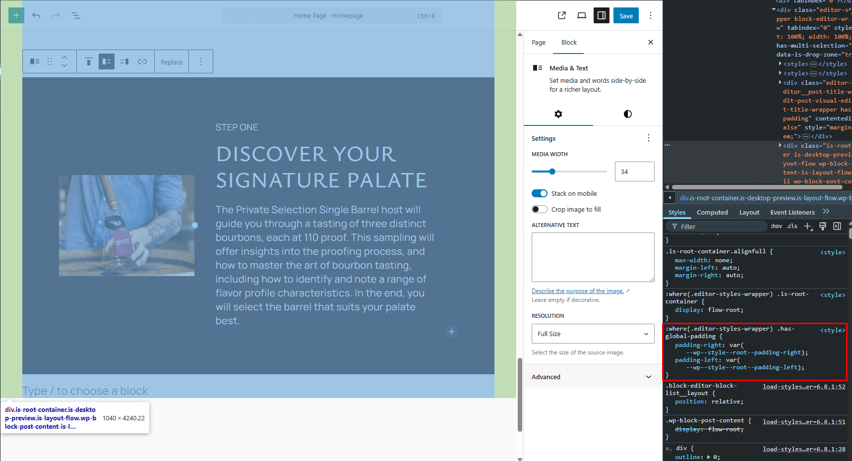
Creates a class that is applied to the blocks container or to all blocks depending on the option useRootPaddingAwareAlignments.
.has-global-padding {
	padding-right: var(--wp--style--root--padding-right);
	padding-left: var(--wp--style--root--padding-left);
}
If you enable
settings.useRootPaddingAwareAlignments: true, then this value is taken into account for full-/wide-blocks: the content inside them will “jump” exactly to the specified padding.- typography.textShadow(string) (WP 7.1)
Sets the
text-shadowCSS property for text.{ "styles": { "typography": { "textShadow": "1px 1px 2px rgb(0 0 0 / 30%)" } } }Value type:
string.Any valid CSS
text-shadowvalue is supported, including multiple shadows separated by commas.To disable the inherited shadow, specify
noneFor an individual block
{
	"styles": {
		"blocks": {
			"core/heading": {
				"typography": {
					"textShadow": "2px 2px 4px rgb(0 0 0 / 40%)"
				}
			}
		}
	}
}
For an element
{
	"styles": {
		"elements": {
			"link": {
				"typography": {
					"textShadow": "1px 1px 2px rgb(0 0 0 / 25%)"
				}
			}
		}
	}
}
You can also use it inside states:
{
	"styles": {
		"elements": {
			"link": {
				":hover": {
					"typography": {
						"textShadow": "none"
					}
				}
			}
		}
	}
}
templateParts
This field is for registering template parts (their metadata). It does not create the template part itself, but only describes an existing file from the /parts folder.
WordPress expects that if you specify "name": "header", the file will be here:
/parts/header.html
Example:
{
	"$schema": "https://schemas.wp.org/trunk/theme.json",
	"version": 3,
	"templateParts": [
		{
			"name": "header",
			"title": "Header",
			"area": "header"
		},
		{
			"name": "footer",
			"title": "Footer",
			"area": "footer"
		}
	]
}
Fields inside the object:
-
name- file name without.html"header"means/parts/header.html"sidebar-shop"means/parts/sidebar-shop.html
-
title- human-readable name in Site Editor- shown in the interface
- can be translated
- it’s better to write something like
Site Header,Shop Sidebar,Landing Footerinstead of justHeader,Sidebar,Footer
-
area- area to which the template part belongs- standard values:
header,footer,sidebar,navigation-overlay(wp 7.0),uncategorized - you can use custom areas, for example
sidebar, but the area itself must be registered via PHP - for
headerandfooter, WordPress uses special block variations
- standard values:
Example with a custom area:
{
	"version": 3,
	"templateParts": [
		{
			"name": "sidebar",
			"title": "Sidebar",
			"area": "sidebar"
		}
	]
}
But for a custom area, you need PHP:
add_filter( 'default_wp_template_part_areas', 'themeslug_template_part_areas' );

function themeslug_template_part_areas( array $areas ): array {
	$areas[] = array(
		'area'        => 'sidebar',
		'area_tag'    => 'section',
		'label'       => __( 'Sidebar', 'themeslug' ),
		'description' => __( 'Sidebar template parts.', 'themeslug' ),
		'icon'        => 'sidebar',
	);

	return $areas;
}
Important: theme.json registers the part, and PHP registers the area.
Usage in the template:
<!-- wp:template-part {"slug":"header","area":"header"} /-->

<!-- wp:template-part {"slug":"sidebar","area":"sidebar"} /-->

<!-- wp:template-part {"slug":"footer","area":"footer"} /-->
What registration via templateParts gives:
- a nice name in Site Editor
- binding to an area: Header, Footer, Sidebar, etc.
- better organization in the site editor
- compatibility with child themes, style variations, and plugins that read these metadata.
patterns
_TODO_ An array of pattern slugs to be registered from the Pattern Directory.
customTemplates
Allows registering templates for regular and arbitrary post types (CPT).
Registration is needed so that the template described in the templates/ folder is defined and linked to the post type.
Limitation: templates are intended only for single posts/pages/CPT.
So that the template is automatically picked up when creating a post, you need to name it according to the template hierarchy. For example, for a post type product it should be single-product.html

Registration example:
{
	"customTemplates": [
		{
			"name": "content-canvas",
			"title": "Content Canvas",
			"postTypes": ["page", "post"]
		},
		{
			"name": "single-product",
			"title": "Single Product",
			"postTypes": ["product"]
		}
	]
}
- name — template file name without extension (the file must be in
/templates). - title — template name (can be translated).
- postTypes — an array of post types for which this template can be selected in the admin (by default
page).
After adding, the template will appear in the “Template” drop-down in the post/page editor:
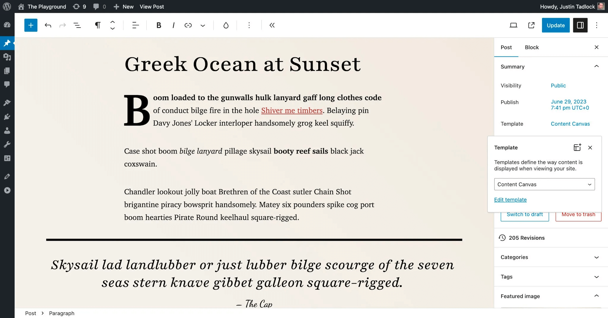
You also need to create the template file /templates/content-canvas.html:
<!-- wp:template-part {"slug":"header","tagName":"header"} /-->

<!-- wp:group {"tagName":"main","layout":{"type":"default"}} -->
<main class="wp-block-group">
	<!-- wp:post-content {"layout":{"type":"constrained"}} /-->
</main>
<!-- /wp:group -->

<!-- wp:template-part {"slug":"footer","tagName":"footer"} /-->
To see how this looks in the site editor, go to Appearance > Editor in the WordPress admin. Then select Content Canvas in the Templates section:
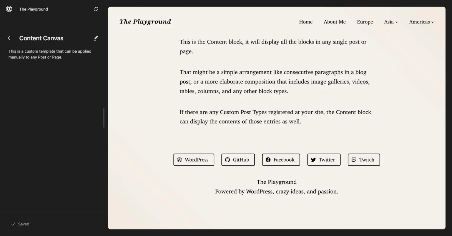
title / slug / description / blockTypes
These parameters relate to style variations; read about them in the corresponding article.
--
Sources: